Fluency
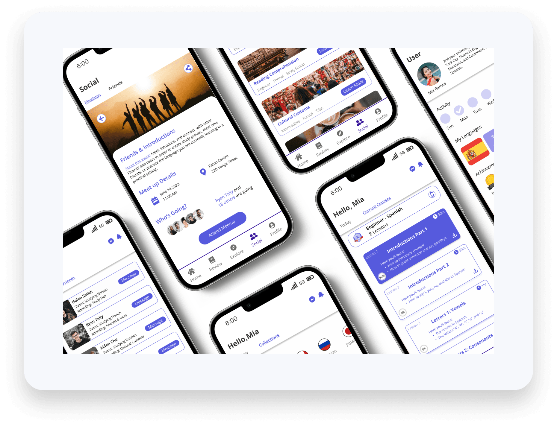
Learning a new language is like embarking on a thrilling adventure, opening doors to new cultures, friendships, and opportunities. Yet, for many, the journey can be daunting, filled with challenges like finding meaningful practice and staying motivated. This case study explores the creation of Fluency, a language learning app designed to transform this journey into a rich, immersive experience.
Client
Fluency
Services
Mobile App Design
Industry
Education
Date
Aug 2023
Problem
How might we help language learners feel immersive in their learning journey while being able to apply what they learn into a real world setting?
Solution
Create a langue learning application that encompasses a variety of learning styles which encourages learners to meet up with each other in order to practice and apply what they have learned.
Research
Research Plan
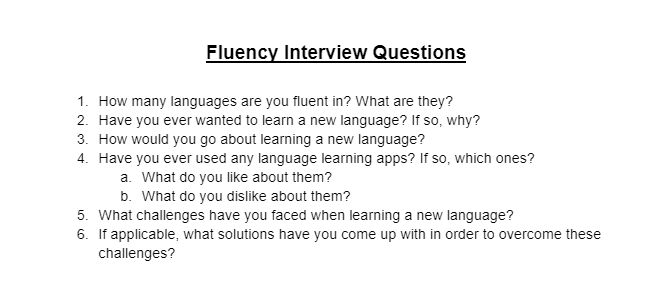
In order for me to design an application for learning languages, I first need to understand my target audience: language learners. Therefore, I interviewed 5 participants with my a varying degree of language learning skills. Some participants only spoke 1 language, others who can speak 3 or more, and some who have English as their second language. The goal of this interview is to find out the reasons as to why they learn languages, how they learn a new language, and if they are familiar with any present language learning applications.
User Interviews
1
Motivations
Opens up job opportunities in different countries
Being able to communicate and connect with family and friends
Opportunities to travel and immerse yourself into different cultures
2
Pain Points
Unable to practice the language they are learning
Applications not covering a variety of learning styles such as visual, auditory, or hands-on
Learning material applications not being in-depth
3
Primary Goals
Being comfortable in publicly speaking the language they are learning
Access to variety of learning material such as podcasts, videos, or articles
Ability to find other learners to help practice and study together

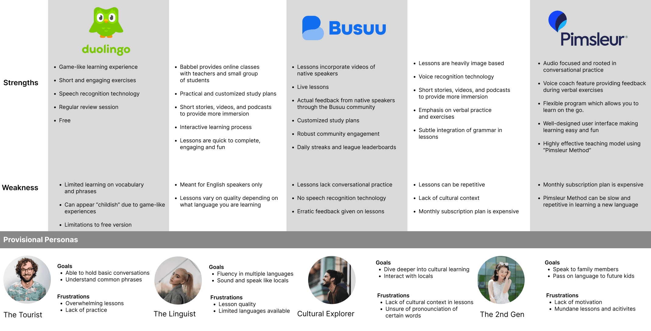
Competitive Analysis
After discovering these insights I wanted to see what current language learning applications offer to language learners. Therefore, I began making a competitive analysis with the goal of finding out what features are successful for them, what is not working for them, and if there are any opportunities for improvement in which I can implement into Fluency.

Define
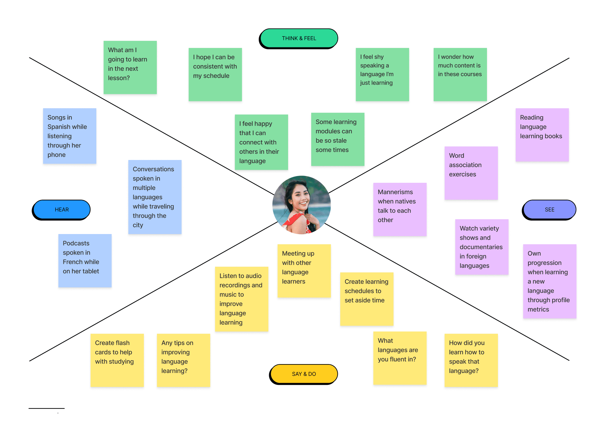
Empathy Map
Combining the insights I gathered from my interviews and competitive analysis, I created an empathy map. This map displays what potential users go through, feel and think of when learning a new language and using a language learning application

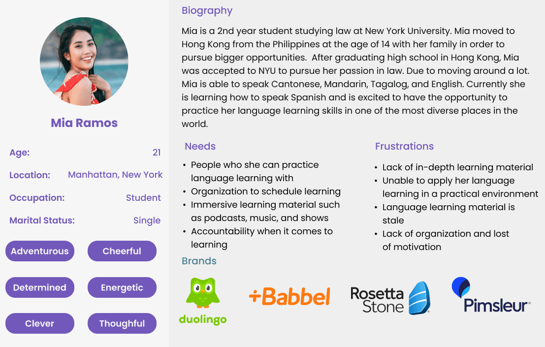
Persona
Meet Mia, our persona - a young professional eager to learn Spanish. Mia's goals and challenges became our guide, ensuring every design decision aligned with real user needs.

Ideate
Information Architecture
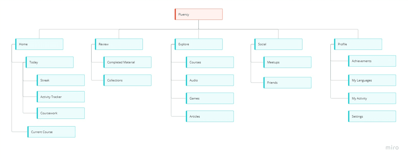
Before sketching or doing any wireframe work, I created an information architecture in order to map out where each tab and screen takes the user and what information is provided to them. This is important because it allows me to create a mental road map on how users complete certain tasks and how much effort they would need to put in order to complete said tasks.

Task Flow
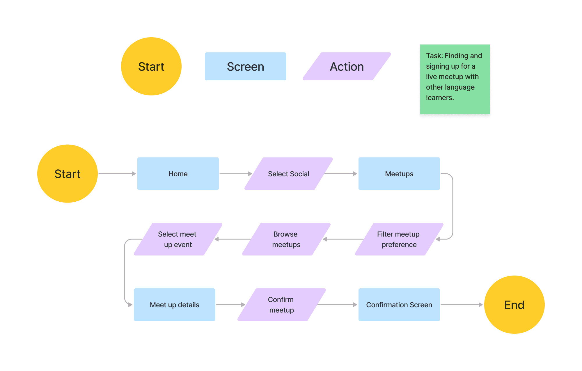
The goal of Fluency is to encourage language learners to meet together and to practice the language they are learning. With that being said, I created a task flow with the focus of finding and signing up for a meetup event.

User Flow
Now I took a step back and wanted a broader perspective on how users may use Fluency's social aspect. With the help of Mia, I created a user flow on how she may navigate and interact with the social tab of Fluency.


Sketches
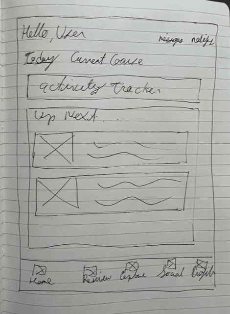
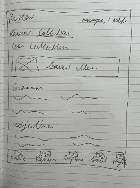
With my information architecture mapped out and before I hop into Figma and begin designing, I created low fidelity sketches as to what Fluency may look like.

Home Screen

Explore Screen
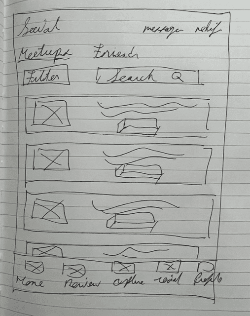

Event Screen
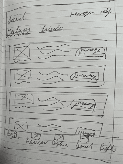

Social Screen
Branding
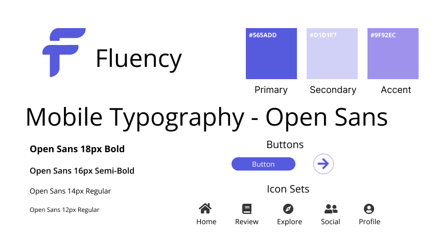
As Fluency is a new application hitting the market, I created its own personal branding. This includes typography, logos, and colours. The reason for the choice of purple is to exude the feeling of wisdom, power and spirituality as language learning can be empowering and grants new knowledge. Open sans is used for the font as it has clean readability and visibility within mobile applications.


Prototype
Low Fidelity Wireframes
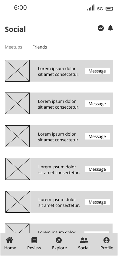
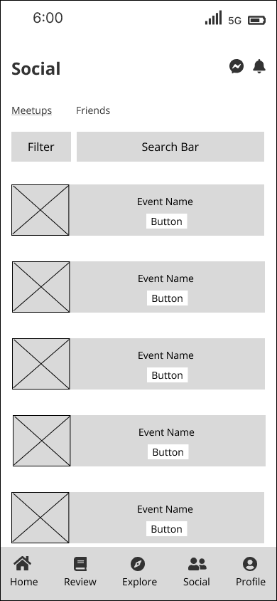
Starting from my initial sketches I created low fidelity wireframes as a baseline to what Fluency can look like. Mapping out each screen and tab keeping in mind the information I have consolidated from my user interviews. In addition, I kept Mia in mind while creating these wireframes to better empathize with potential users.
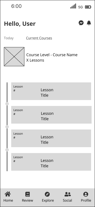

HomeScreen
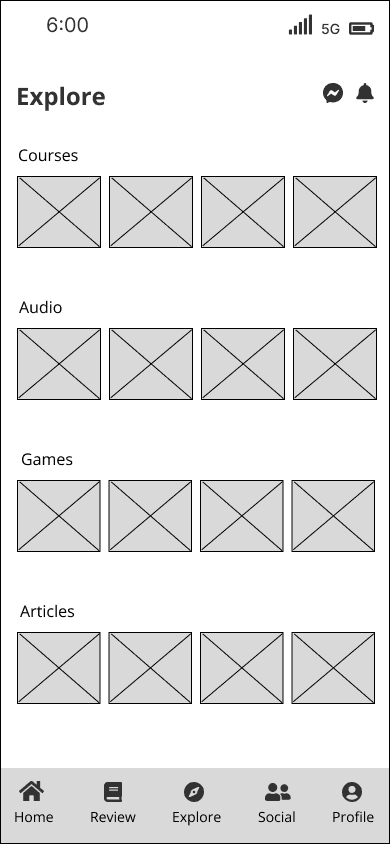

Explore Screen

Event Screen

Social Screen
High Fidelity Wireframes
Now that I have created a brand style for Fluency, I combined it with my low fidelity wireframes to create high fidelity wireframes. These wireframes will be used in my usability testing to gain feedback and to iterate on for both design and user experience improvements.
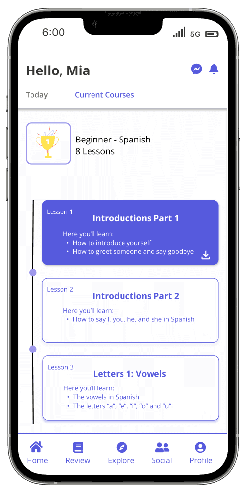

Profile Screen
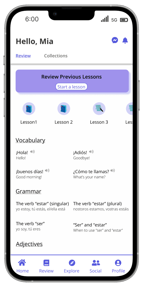

Review Screen
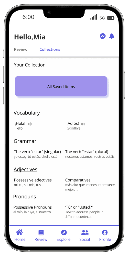

Explore Screen
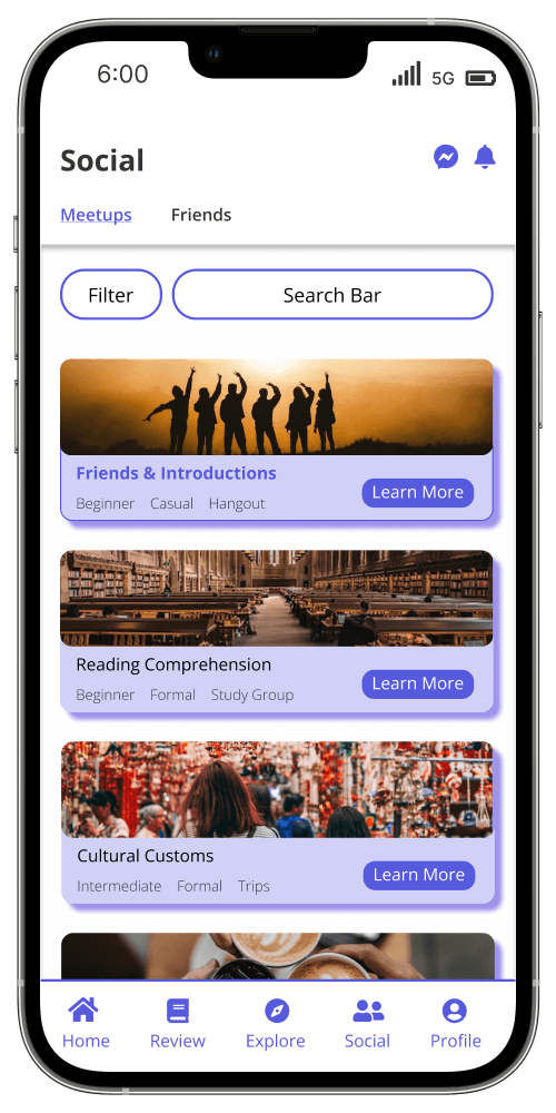

Meetups Screen
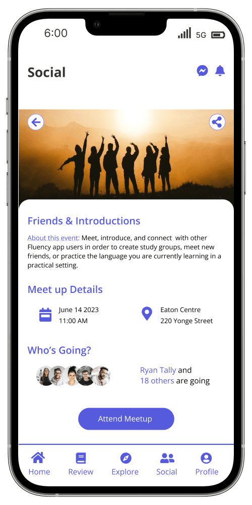

Meetup Details
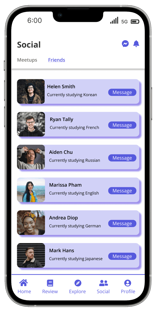

Friend Screen
Testing
Affinity Map
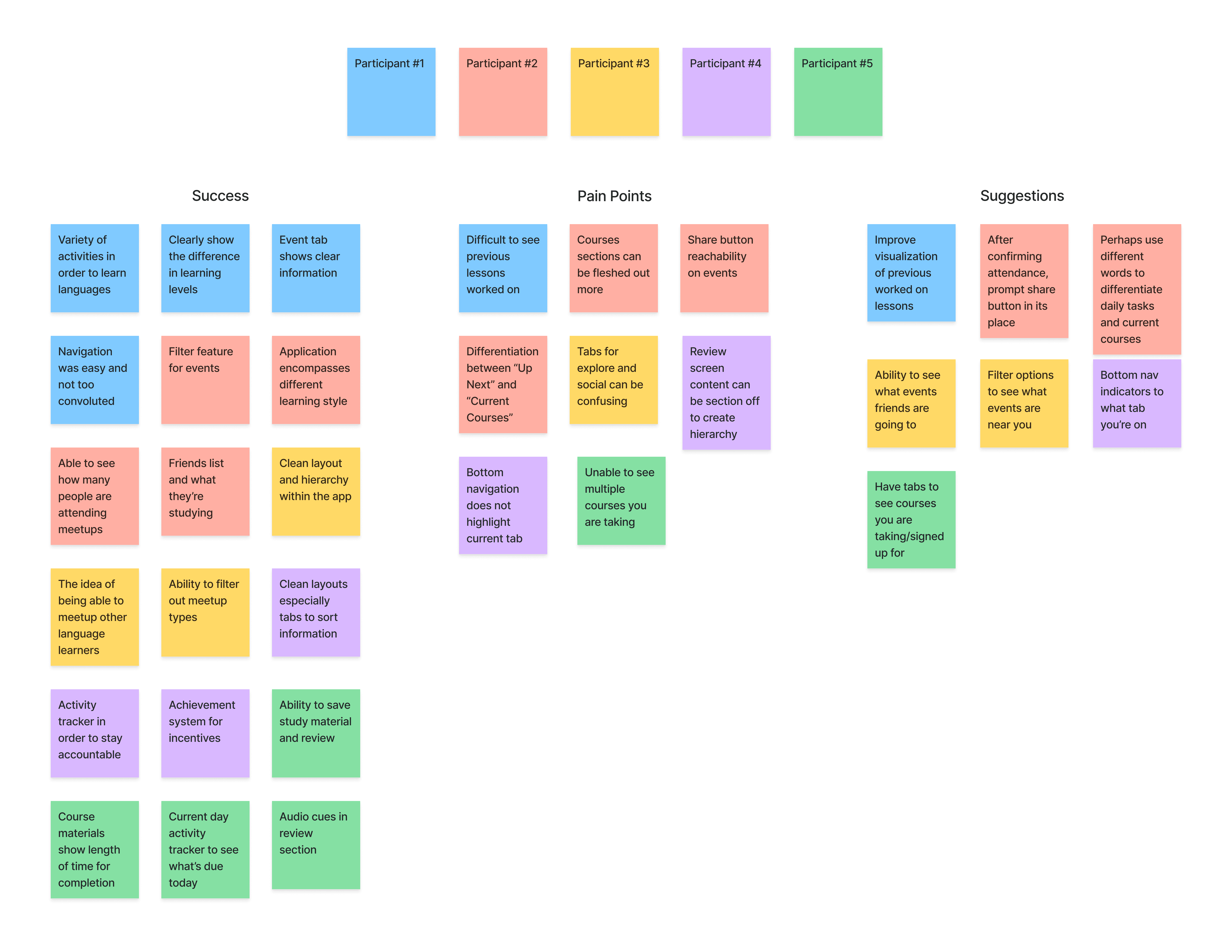
After creating my prototype from my low fidelity wireframes, I managed to conduct a usability test with 5 participants. These tests were conducted through the use of Maze and discord as well as in person meetings. The results of the usability test allowed me to create an affinity map which enable me to identify and categorize successful factors, pain points, and suggestions each participant voiced during the usability testing period.

Iterations
Creating a brand identity will elevate Zeit into achieving its goals and the user experience. In order to establish a brand identity, I created several artifacts such as logos, mood boards and style tile. I also created a UI kit in order to specify fonts, colours, logos, and imagery to assist in designing the user interface.
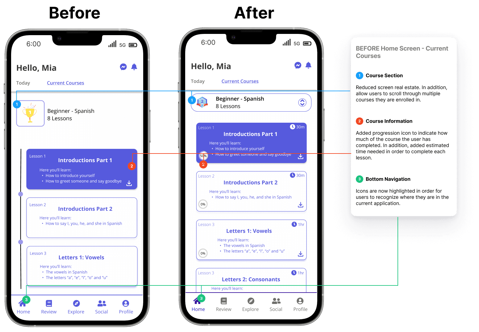

Home Screen
Added course progress indicator to allow users to know how much time left there is within a course. In addition, reduced screen real estate by allowing users to scroll through multiple courses they are enrolled in.
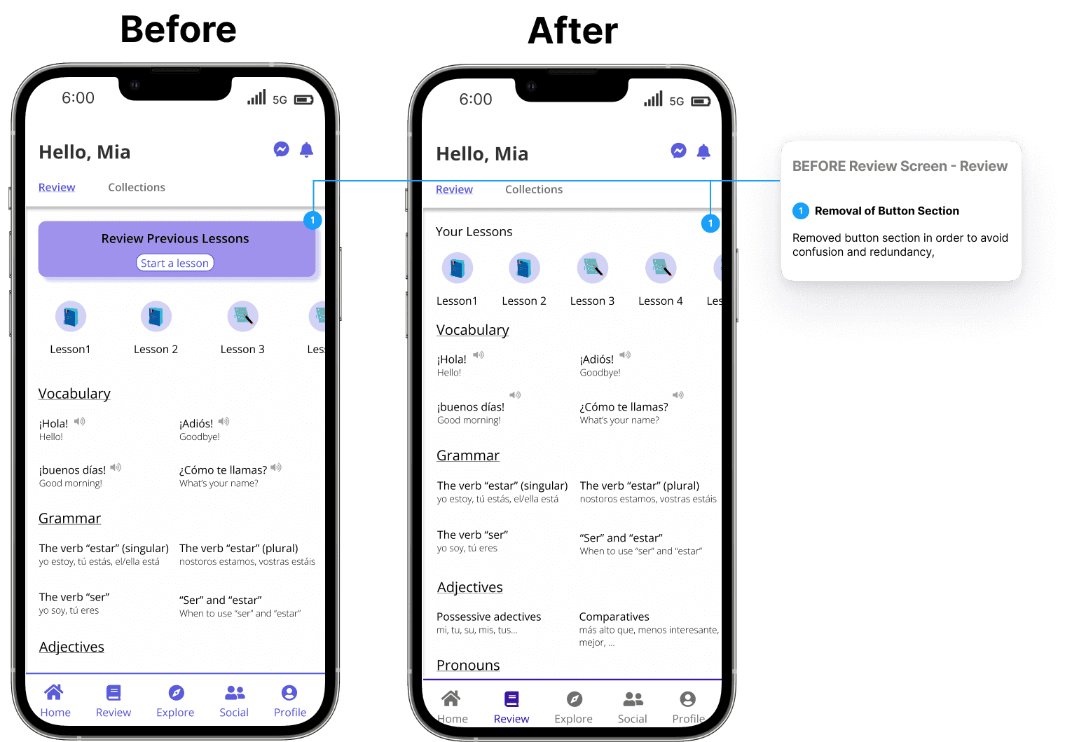
Review Screen
Removed button section in order to avoid confusion and redundancy.

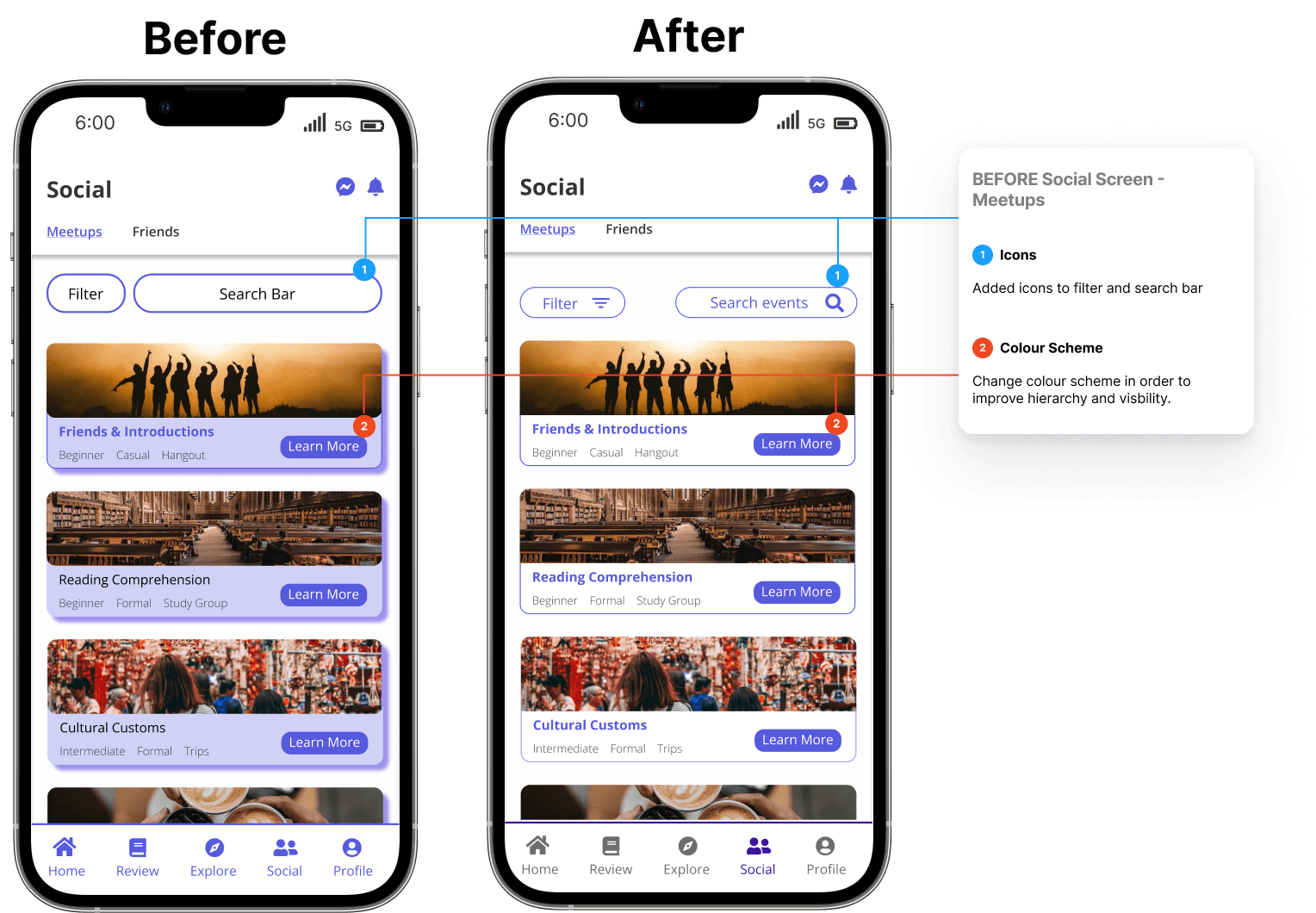

Meetup Screen
Added icons to filter and search bar. In addition changed colour scheme in order to improve hiearchy and visibility.
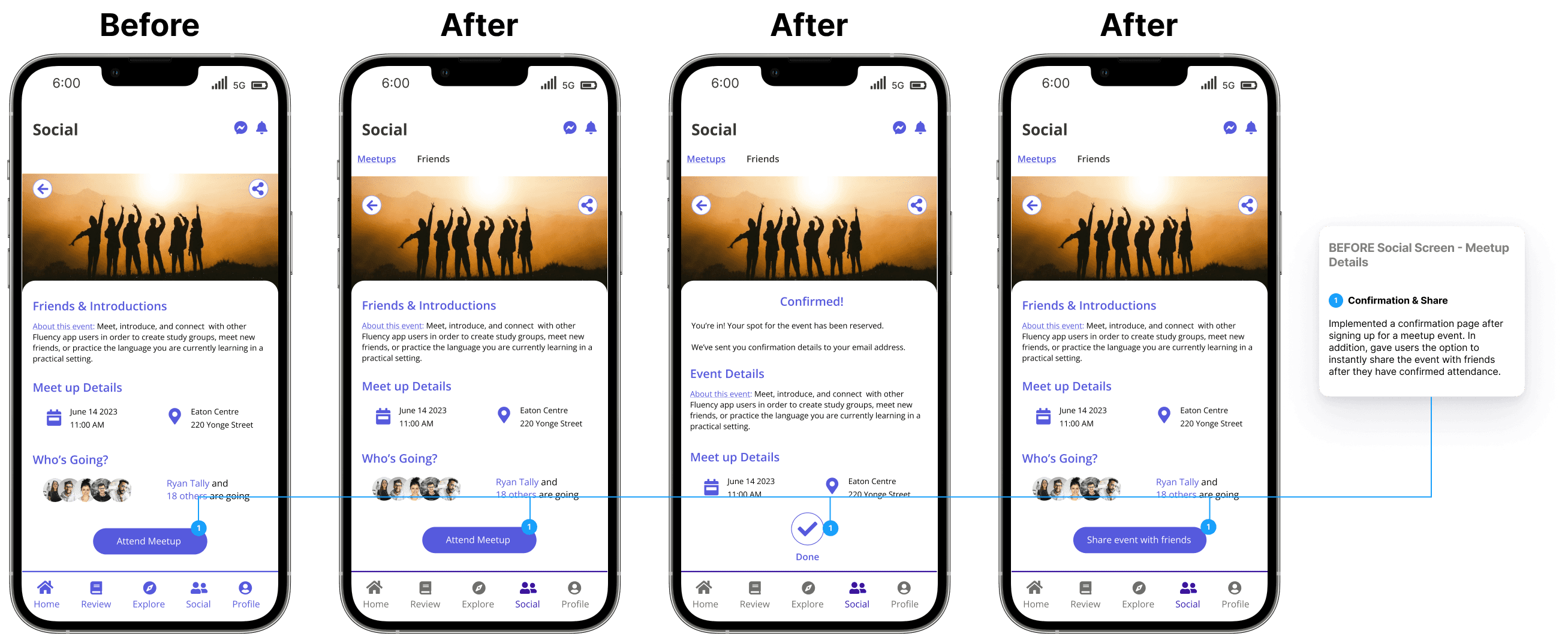
Meetup Details
Implemented a confirmation poage after signing up for a meetup event. In addition, gave users the option to instantly share the event with friends.

Conclusion
Thoughts
1
Final Words
This was my passion project as I am currently learning a new language for myself. Listening and trying to understand different perspectives on how language learners learn and their point of view on what is the "correct" way to learn was difficult as there was no definitive answer.
2
Challenges
Prioritizing what feedback and changes should be implemented into Fluency. Some feedback overlapped among users and some feedback was exclusive to one specific user. However, the balancing act between the majority versus the minority is difficult if the majority feedback is something small rather than a minority feedback has a larger overall impact
Setting aside my bias as a language learning. Reminding myself that I am designing for the user and not myself.
3
Key Takeaways
Taking my time and thoroughly understanding my users feedback is of the utmost importance. User feedback gave me a unique point of view and opens up opportunities I have overlooked or not yet discovered
Although feedback is important, the ability to prioritize what should be implemented into the design is crucial. As designers, we always want our end result to be perfect but that cannot be the case. There will be future projects in which we are unable to fit ever user's feedback. Ever after a project is marked as "completed" there is always room for iteration
Other Projects
Let's Connect!
Matthewperezdesign@gmail.com
Learning a new language is like embarking on a thrilling adventure, opening doors to new cultures, friendships, and opportunities. Yet, for many, the journey can be daunting, filled with challenges like finding meaningful practice and staying motivated. This case study explores the creation of Fluency, a language learning app designed to transform this journey into a rich, immersive experience.
Client
Fluency
Services
Mobile App Design
Industry
Education
Date
Aug 2023


Problem
How might we help language learners feel immersive in their learning journey while being able to apply what they learn into a real world setting?
Solution
Create a langue learning application that encompasses a variety of learning styles which encourages learners to meet up with each other in order to practice and apply what they have learned.
Research
Research
Research Plan
In order for me to design an application for learning languages, I first need to understand my target audience: language learners. Therefore, I interviewed 5 participants with my a varying degree of language learning skills. Some participants only spoke 1 language, others who can speak 3 or more, and some who have English as their second language. The goal of this interview is to find out the reasons as to why they learn languages, how they learn a new language, and if they are familiar with any present language learning applications.
User Interviews
1
Motivations
Opens up job opportunities in different countries
Being able to communicate and connect with family and friends
Opportunities to travel and immerse yourself into different cultures
2
Pain Points
Unable to practice the language they are learning
Applications not covering a variety of learning styles such as visual, auditory, or hands-on
Learning material applications not being in-depth
3
Primary Goals
Being comfortable in publicly speaking the language they are learning
Access to variety of learning material such as podcasts, videos, or articles
Ability to find other learners to help practice and study together


Competitive Analysis
After discovering these insights I wanted to see what current language learning applications offer to language learners. Therefore, I began making a competitive analysis with the goal of finding out what features are successful for them, what is not working for them, and if there are any opportunities for improvement in which I can implement into Fluency.


Define
Define
Empathy Map
Combining the insights I gathered from my interviews and competitive analysis, I created an empathy map. This map displays what potential users go through, feel and think of when learning a new language and using a language learning application


Persona
Meet Mia, our persona - a young professional eager to learn Spanish. Mia's goals and challenges became our guide, ensuring every design decision aligned with real user needs.


Ideate
Ideate
Information Architecture
Before sketching or doing any wireframe work, I created an information architecture in order to map out where each tab and screen takes the user and what information is provided to them. This is important because it allows me to create a mental road map on how users complete certain tasks and how much effort they would need to put in order to complete said tasks.


Task Flow
The goal of Fluency is to encourage language learners to meet together and to practice the language they are learning. With that being said, I created a task flow with the focus of finding and signing up for a meetup event.


User Flow
Now I took a step back and wanted a broader perspective on how users may use Fluency's social aspect. With the help of Mia, I created a user flow on how she may navigate and interact with the social tab of Fluency.


Sketches
With my information architecture mapped out and before I hop into Figma and begin designing, I created low fidelity sketches as to what Fluency may look like.


Home Screen


Explore Screen


Event Screen


Social Screen
Branding
As Fluency is a new application hitting the market, I created its own personal branding. This includes typography, logos, and colours. The reason for the choice of purple is to exude the feeling of wisdom, power and spirituality as language learning can be empowering and grants new knowledge. Open sans is used for the font as it has clean readability and visibility within mobile applications.


Prototype
Prototype
Low Fidelity Wireframes
Starting from my initial sketches I created low fidelity wireframes as a baseline to what Fluency can look like. Mapping out each screen and tab keeping in mind the information I have consolidated from my user interviews. In addition, I kept Mia in mind while creating these wireframes to better empathize with potential users.


HomeScreen


Explore Screen


Event Screen


Social Screen
High Fidelity Wireframes
Now that I have created a brand style for Fluency, I combined it with my low fidelity wireframes to create high fidelity wireframes. These wireframes will be used in my usability testing to gain feedback and to iterate on for both design and user experience improvements.


Profile Screen


Review Screen


Explore Screen


Meetups Screen


Meetup Details


Friend Screen
Testing
Testing
Affinity Map
After creating my prototype from my low fidelity wireframes, I managed to conduct a usability test with 5 participants. These tests were conducted through the use of Maze and discord as well as in person meetings. The results of the usability test allowed me to create an affinity map which enable me to identify and categorize successful factors, pain points, and suggestions each participant voiced during the usability testing period.


Iterations
With this information, I began iterating on my wireframes and making key changes. Below I have posted a before and after to highlight what changes have been made in order to create my high fidelity wireframes for Fluency.


HomeScreen
Added course progress indicator to allow users to know how much time left there is within a course. In addition, reduced screen real estate by allowing users to scroll through multiple courses they are enrolled in.
Review Screen
Removed button section in order to avoid confusion and redundancy.


Meetup Screen
Added icons to filter and search bar. In addition changed colour scheme in order to improve hiearchy and visibility.
Meetup Details
Implemented a confirmation poage after signing up for a meetup event. In addition, gave users the option to instantly share the event with friends.


Conclusion
Conclusion
Thoughts
1
Final Words
This was my passion project as I am currently learning a new language for myself. Listening and trying to understand different perspectives on how language learners learn and their point of view on what is the "correct" way to learn was difficult as there was no definitive answer.
2
Challenges
Prioritizing what feedback and changes should be implemented into Fluency. Some feedback overlapped among users and some feedback was exclusive to one specific user. However, the balancing act between the majority versus the minority is difficult if the majority feedback is something small rather than a minority feedback has a larger overall impact
Setting aside my bias as a language learning. Reminding myself that I am designing for the user and not myself.
3
Key Takeaways
Taking my time and thoroughly understanding my users feedback is of the utmost importance. User feedback gave me a unique point of view and opens up opportunities I have overlooked or not yet discovered
Although feedback is important, the ability to prioritize what should be implemented into the design is crucial. As designers, we always want our end result to be perfect but that cannot be the case. There will be future projects in which we are unable to fit ever user's feedback. Ever after a project is marked as "completed" there is always room for iteration
Let's Connect!
Matthewperezdesign@gmail.com
Let's Connect!
Matthewperezdesign@gmail.com
Learning a new language is like embarking on a thrilling adventure, opening doors to new cultures, friendships, and opportunities. Yet, for many, the journey can be daunting, filled with challenges like finding meaningful practice and staying motivated. This case study explores the creation of Fluency, a language learning app designed to transform this journey into a rich, immersive experience.
Client
Fluency
Services
Mobile App Design
Industry
Education
Date
Aug 2023


Problem
How might we help language learners feel immersive in their learning journey while being able to apply what they learn into a real world setting?
Solution
Create a langue learning application that encompasses a variety of learning styles which encourages learners to meet up with each other in order to practice and apply what they have learned.
Research
Research
Research Plan
In order for me to design an application for learning languages, I first need to understand my target audience: language learners. Therefore, I interviewed 5 participants with my a varying degree of language learning skills. Some participants only spoke 1 language, others who can speak 3 or more, and some who have English as their second language. The goal of this interview is to find out the reasons as to why they learn languages, how they learn a new language, and if they are familiar with any present language learning applications.
User Interviews
1
Motivations
Opens up job opportunities in different countries
Being able to communicate and connect with family and friends
Opportunities to travel and immerse yourself into different cultures
2
Pain Points
Unable to practice the language they are learning
Applications not covering a variety of learning styles such as visual, auditory, or hands-on
Learning material applications not being in-depth
3
Primary Goals
Being comfortable in publicly speaking the language they are learning
Access to variety of learning material such as podcasts, videos, or articles
Ability to find other learners to help practice and study together


Competitive Analysis
After discovering these insights I wanted to see what current language learning applications offer to language learners. Therefore, I began making a competitive analysis with the goal of finding out what features are successful for them, what is not working for them, and if there are any opportunities for improvement in which I can implement into Fluency.


Define
Define
Empathy Map
Combining the insights I gathered from my interviews and competitive analysis, I created an empathy map. This map displays what potential users go through, feel and think of when learning a new language and using a language learning application


Persona
Meet Mia, our persona - a young professional eager to learn Spanish. Mia's goals and challenges became our guide, ensuring every design decision aligned with real user needs.


Ideate
Ideate
Information Architecture
Before sketching or doing any wireframe work, I created an information architecture in order to map out where each tab and screen takes the user and what information is provided to them. This is important because it allows me to create a mental road map on how users complete certain tasks and how much effort they would need to put in order to complete said tasks.


Task Flow
The goal of Fluency is to encourage language learners to meet together and to practice the language they are learning. With that being said, I created a task flow with the focus of finding and signing up for a meetup event.


User Flow
Now I took a step back and wanted a broader perspective on how users may use Fluency's social aspect. With the help of Mia, I created a user flow on how she may navigate and interact with the social tab of Fluency.


Sketches
With my information architecture mapped out and before I hop into Figma and begin designing, I created low fidelity sketches as to what Fluency may look like.

Home Screen

Explore Screen

Event Screen

Social Screen
Branding
As Fluency is a new application hitting the market, I created its own personal branding. This includes typography, logos, and colours. The reason for the choice of purple is to exude the feeling of wisdom, power and spirituality as language learning can be empowering and grants new knowledge. Open sans is used for the font as it has clean readability and visibility within mobile applications.


Prototype
Prototype
Low Fidelity Wireframes
Starting from my initial sketches I created low fidelity wireframes as a baseline to what Fluency can look like. Mapping out each screen and tab keeping in mind the information I have consolidated from my user interviews. In addition, I kept Mia in mind while creating these wireframes to better empathize with potential users.

HomeScreen

Explore Screen

Event Screen

Social Screen
High Fidelity Wireframes
Now that I have created a brand style for Fluency, I combined it with my low fidelity wireframes to create high fidelity wireframes. These wireframes will be used in my usability testing to gain feedback and to iterate on for both design and user experience improvements.


Profile Screen


Review Screen


Explore Screen


Meetups Screen


Meetup Details


Friend Screen
Testing
Testing
Affinity Map
After creating my prototype from my low fidelity wireframes, I managed to conduct a usability test with 5 participants. These tests were conducted through the use of Maze and discord as well as in person meetings. The results of the usability test allowed me to create an affinity map which enable me to identify and categorize successful factors, pain points, and suggestions each participant voiced during the usability testing period.


Iterations
With this information, I began iterating on my wireframes and making key changes. Below I have posted a before and after to highlight what changes have been made in order to create my high fidelity wireframes for Fluency.


HomeScreen
Added course progress indicator to allow users to know how much time left there is within a course. In addition, reduced screen real estate by allowing users to scroll through multiple courses they are enrolled in.
Review Screen
Removed button section in order to avoid confusion and redundancy.


Meetup Screen
Added icons to filter and search bar. In addition changed colour scheme in order to improve hiearchy and visibility.


Meetup Details
Implemented a confirmation poage after signing up for a meetup event. In addition, gave users the option to instantly share the event with friends.
Conclusion
Conclusion
Thoughts
1
Final Words
This was my passion project as I am currently learning a new language for myself. Listening and trying to understand different perspectives on how language learners learn and their point of view on what is the "correct" way to learn was difficult as there was no definitive answer.
2
Challenges
Prioritizing what feedback and changes should be implemented into Fluency. Some feedback overlapped among users and some feedback was exclusive to one specific user. However, the balancing act between the majority versus the minority is difficult if the majority feedback is something small rather than a minority feedback has a larger overall impact
Setting aside my bias as a language learning. Reminding myself that I am designing for the user and not myself.
3
Key Takeaways
Taking my time and thoroughly understanding my users feedback is of the utmost importance. User feedback gave me a unique point of view and opens up opportunities I have overlooked or not yet discovered
Although feedback is important, the ability to prioritize what should be implemented into the design is crucial. As designers, we always want our end result to be perfect but that cannot be the case. There will be future projects in which we are unable to fit ever user's feedback. Ever after a project is marked as "completed" there is always room for iteration
Other Projects
Let's Connect!
Matthewperezdesign@gmail.com
Let's Connect!
Matthewperezdesign@gmail.com
