Chiq Beauty
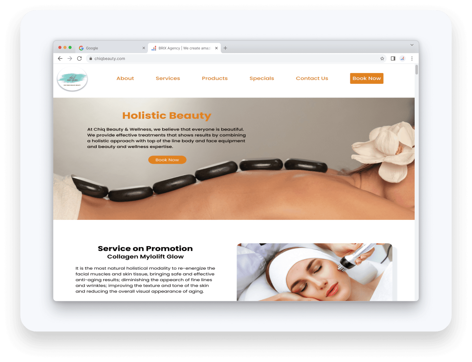
Chiq Beauty & Wellness is an independent business establish in 2006, offering a range of services from haircuts to customized skincare treatments. By combining a holistic approach with advanced and innovative skin care product and over 24 years of experience, Chiq's Beauty & Wellness provides effective treatments that show results and improvement of overall health.
Client
Chiq Beauty
Services
Web Design Branding
Industry
Beauty & Wellness
Date
November 2022
Problem
Despite a strong reputation for effective and personalized care, Chiq's online presence is scattered across Instagram, Facebook, and Vagaro. How might we consolidate these platforms into a unified, intuitive hub for customers?
Solution
Create a website that will allow the owner to have more control of her brand and easily reach her clientele. Streamline her existing presence online into one place in order for clients to have a smooth booking process, access to detailed information, and overview of her services and products.
Research
Research Plan
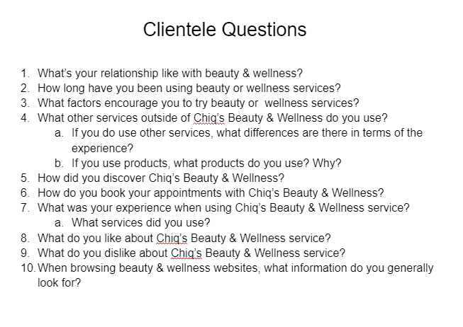
To understand the business better, I began by interviewing the owner and existing clientele. Through these conversations I learned that while word-of-mouth referrals were key to acquiring new customers, the lack of cohesive online presence was hindering the business's growth. Customers wanted a seamless booking process and easy access to detailed information about services and products.
User Interviews
1
Motivations
Users want to feel good and look good
Helping independent business owners over corporations
Unique service Chiq provides that are unavailable in other competitors
2
Pain Points
Unable to purchase products from client due to lack of product pages
Finding ways to book is tedious and makes users give up
Lack of images on how business owner conducts services
3
Primary Goals
Visible platform that makes it easy for users to book appointments
Visuals in order for users to have an idea what the services are like and what the results may be
Easily obtain information about any product or service

Competitive Analysis
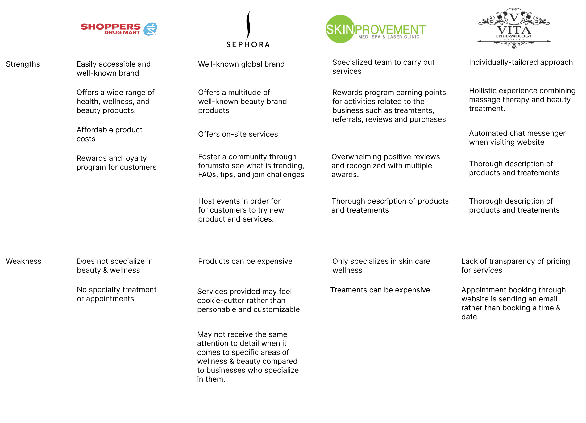
Taking it one step further, I conducted a competitve analysis of the business landscape. I wanted to get a deeper understanding of the industry and what factors contribute to a business's success and failures. My client strictly runs her business by herself and proves to be quite challenging when she competes not only with known good brand companies, but other small businesses as well.

Define
Empathy Map
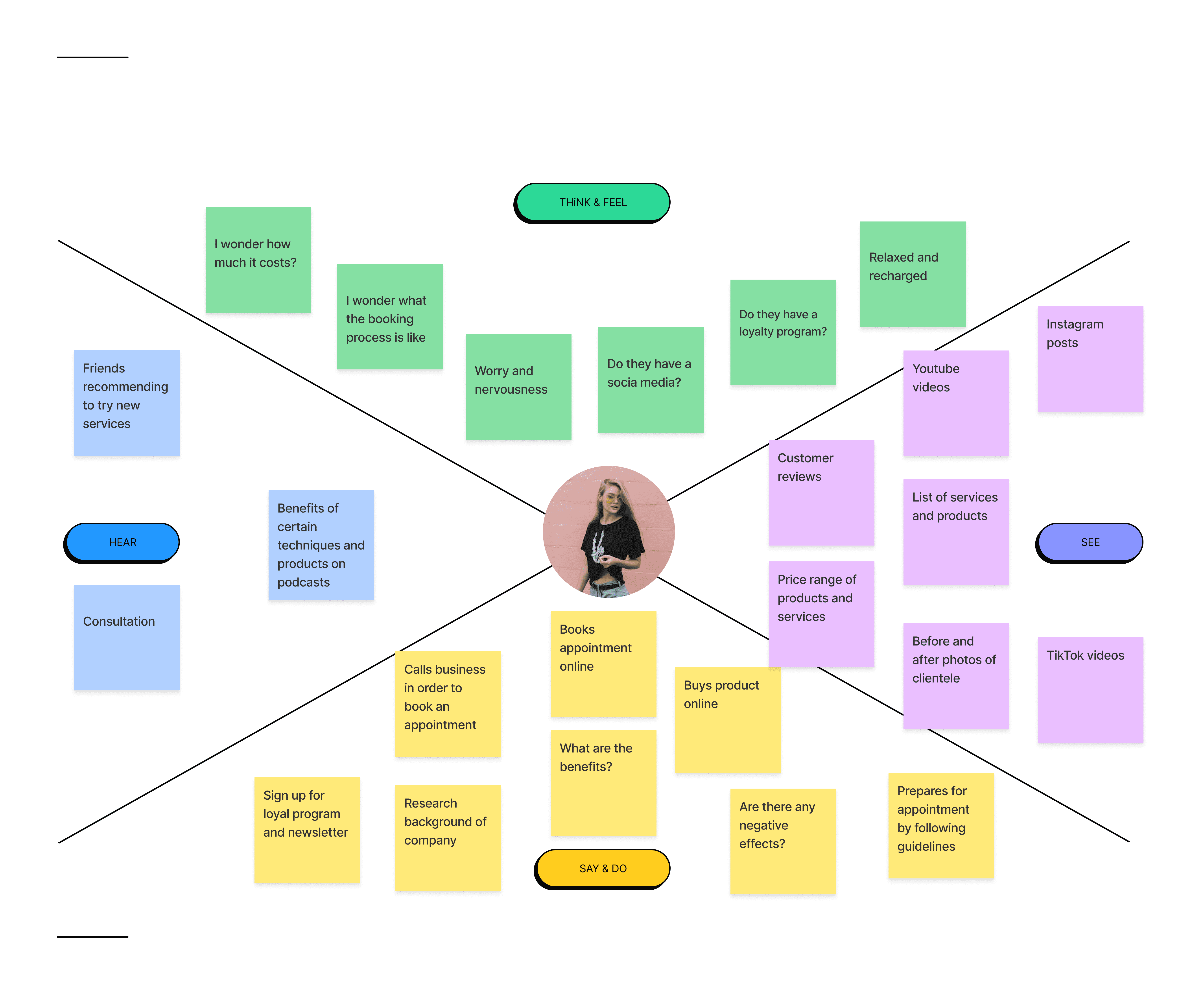
Now that I have my research completed, I created an empathy map in order to help guide the design process. I wanted to empathize with the user journey from discovering the business. booking an appointment, getting treatment, and what happens after the appointment.

Persona
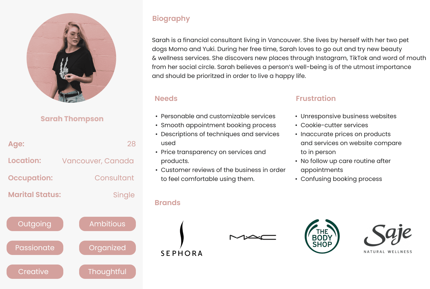
Using the findings from my user interviews and the empathy map I created, I managed to crate a persona, Sarah Thompson, in order to aid me in my design process. I will be referring back to Sarah when it comes to making design decisions as she represents the human factor in the design.

Ideate
Information Architecture
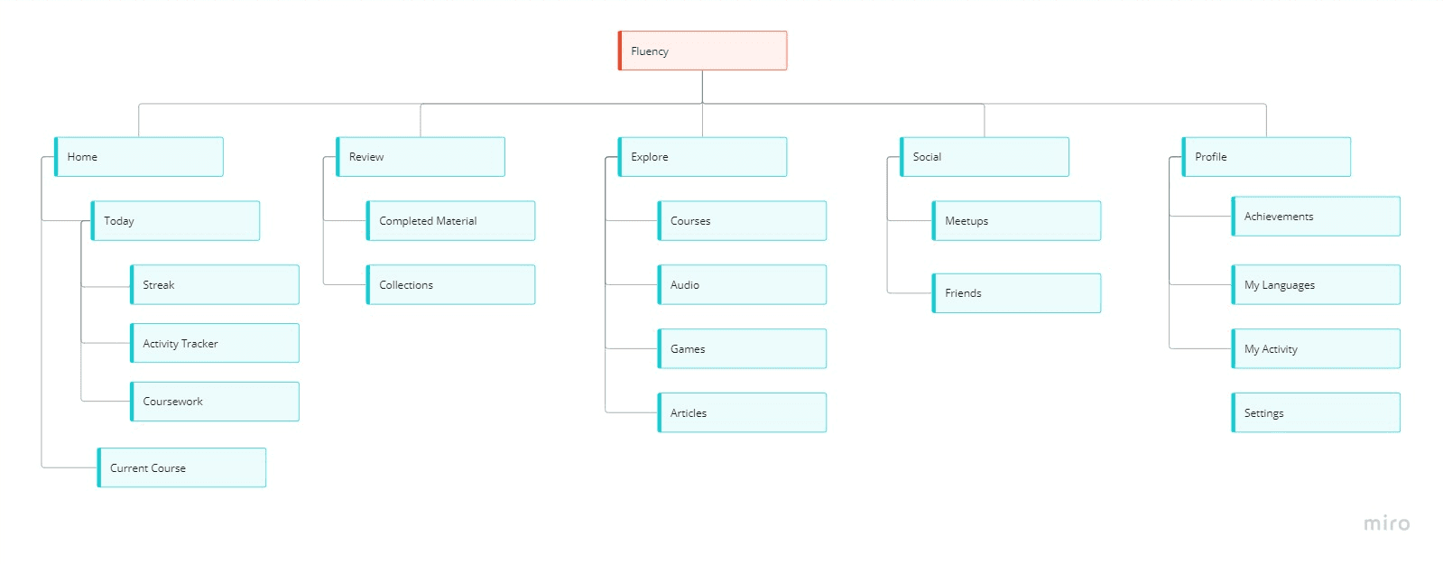
The goal was to create a website that not only met the business objectives but also resonated with users. I mapped out the site structure with the use of my clients current online presnece in Vagaro and secondary research from her competitors. I wanted to ensure that not only the existing information is updated but also add additional sections that my client lacked and what my users would like to see.

Task Flow
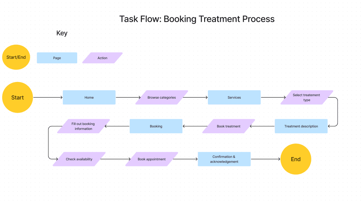
From my earlier meeting with my client, her main goal was for her customers to book a treatment session via her website. In addition, from the data I gathered from my user interviews, I incorporated their goals in mind which is to find information on specific treatments and having an intuitivie booking process. With these two goals aligning, I decided to create a task flow with the goal of booking skin care treatments.

User Flow
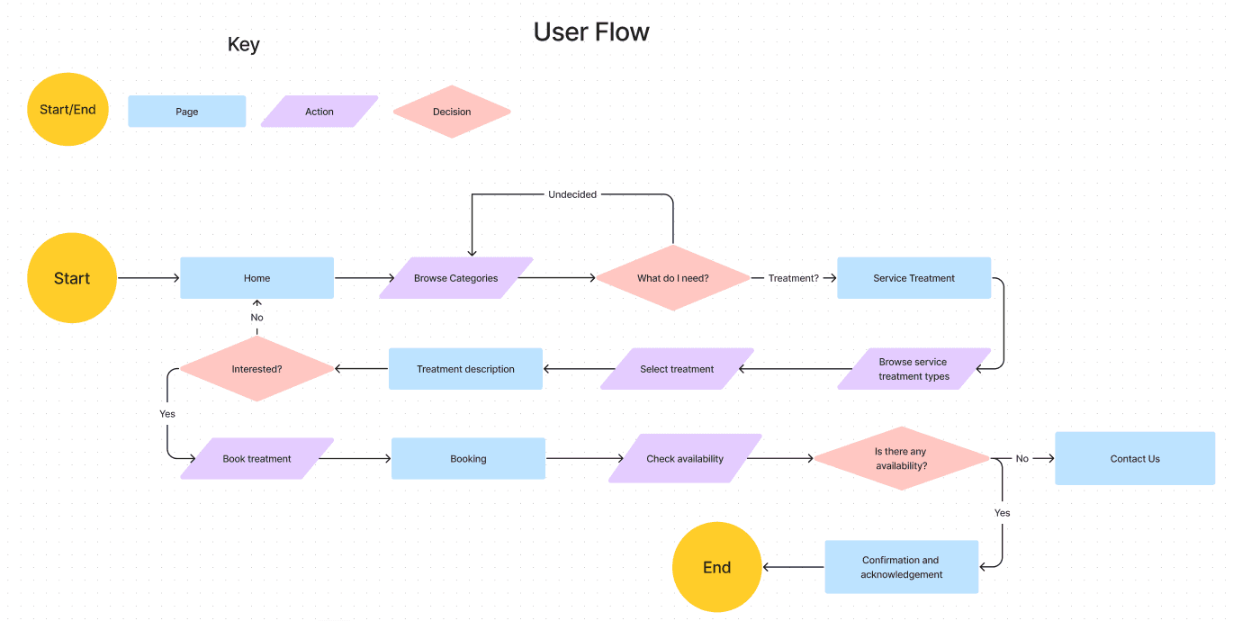
Keeping Sarah in mind, I took the task flow a step further and created a user flow. I wanted to visualize Sarah's journey when navigating through Chiq's Beauty & Wellness website.

Sketches
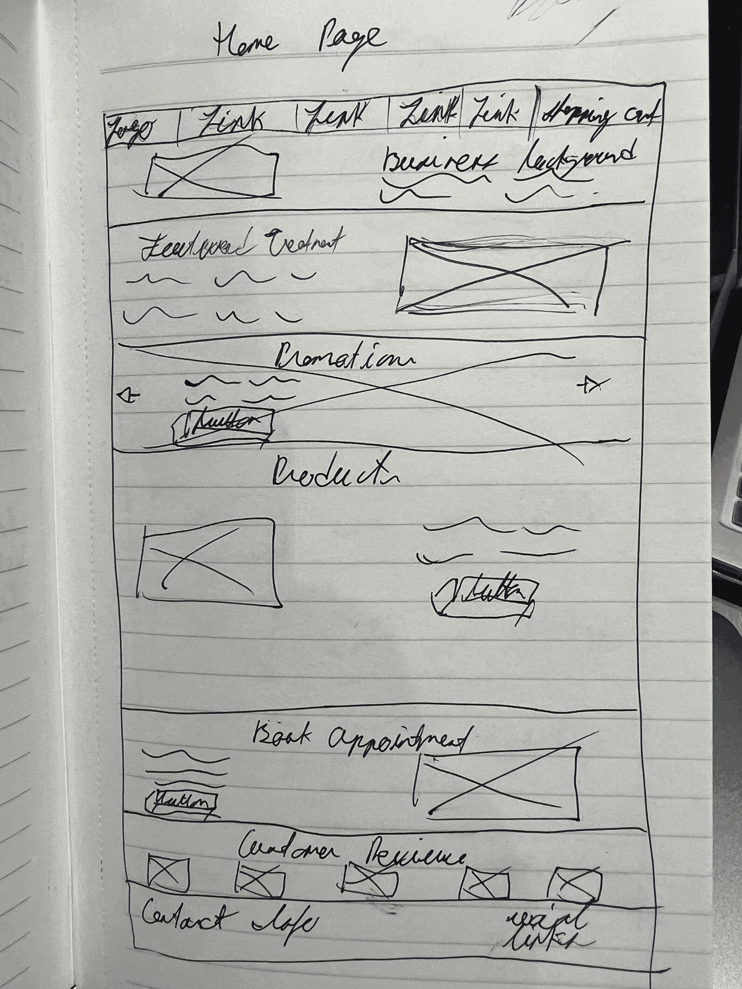
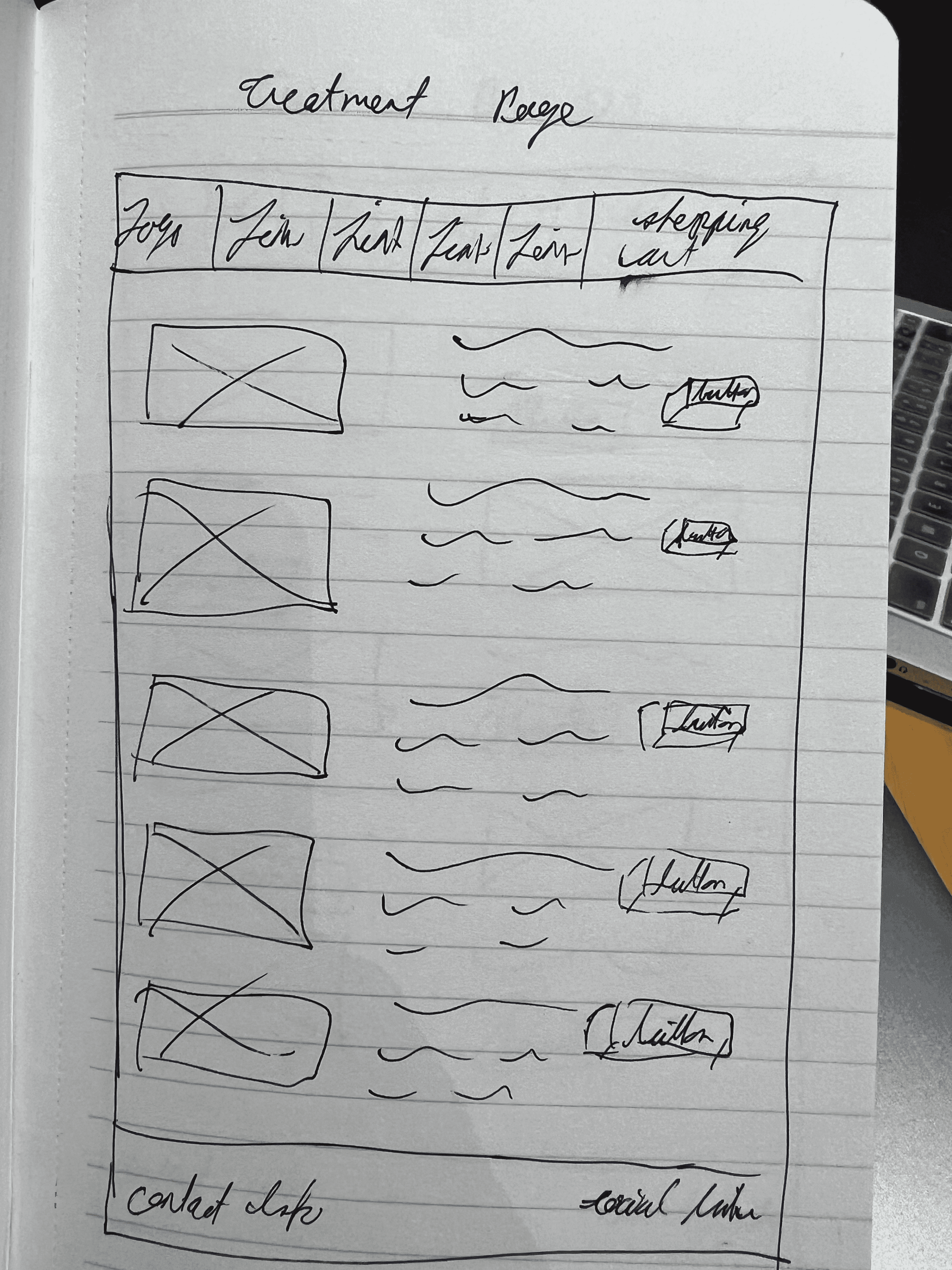
Now that I have established my information architecture, I decided to create some sketches of potential layouts before doing any wireframes, These sketches will give me a better sense of direction as to what I can design before jumping into Figma.

Homepage

Treatment Page
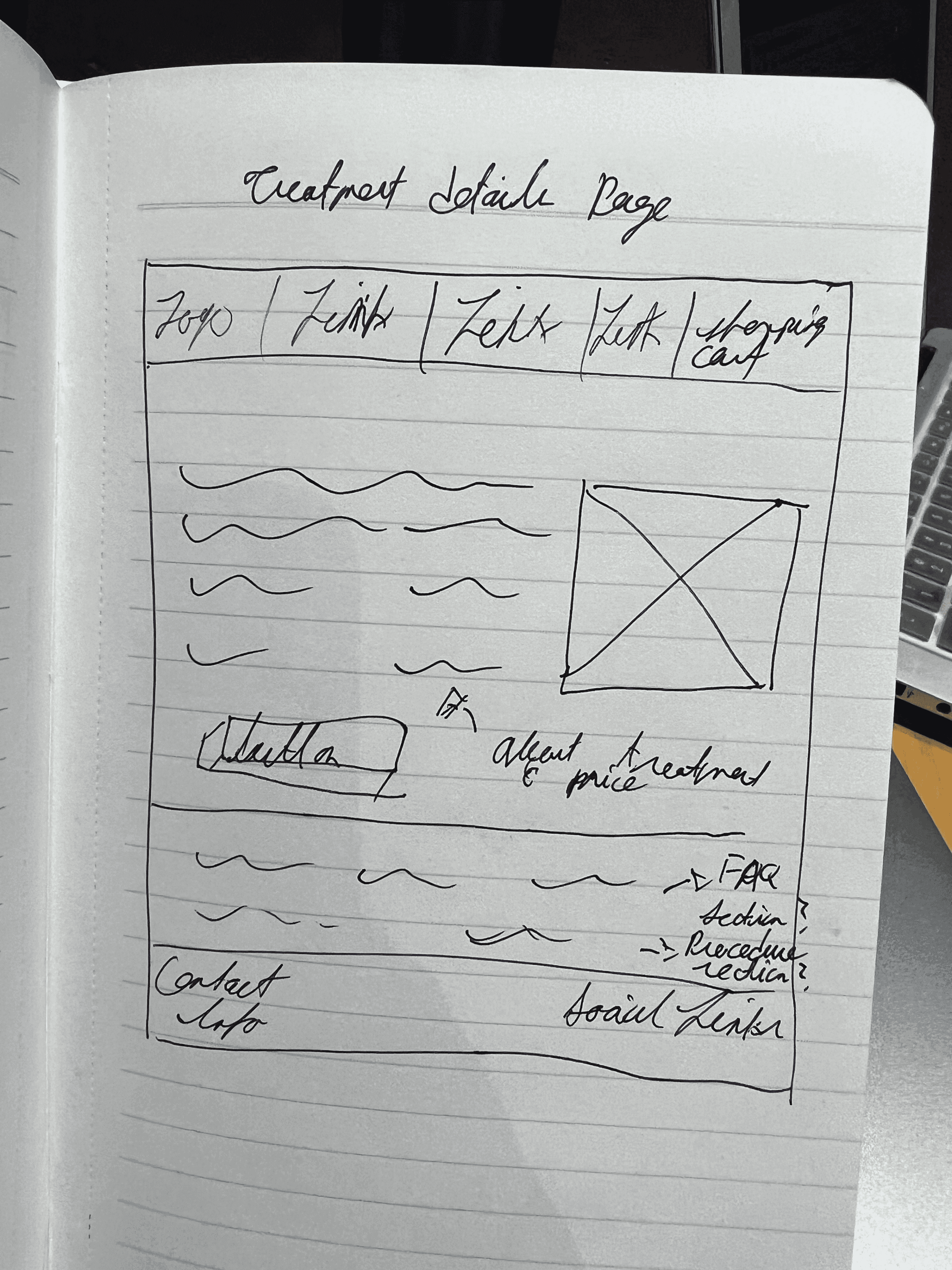

Treatment Details Page
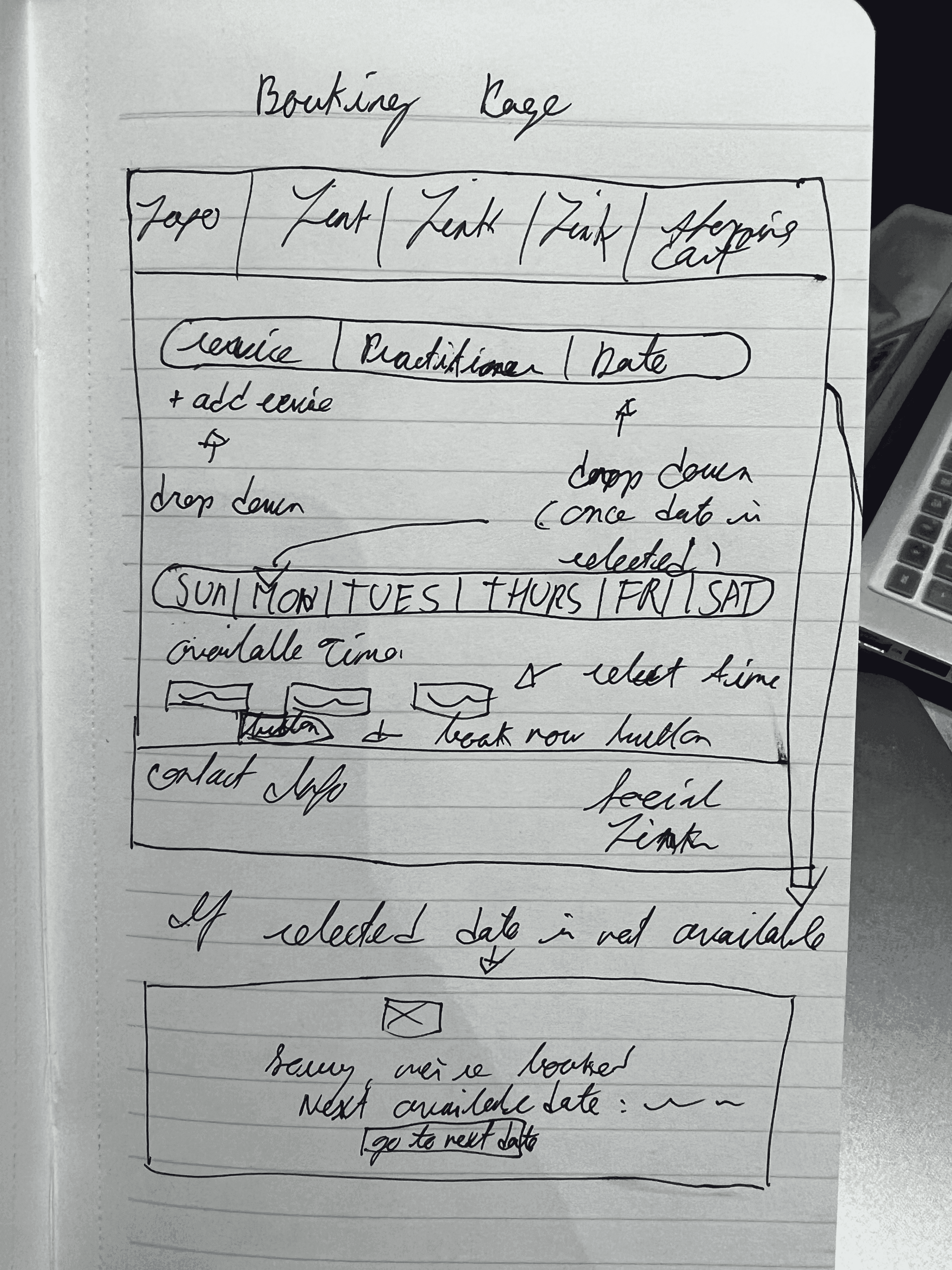

Booking Page
Branding
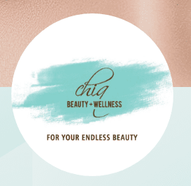
I consulted my client to see if she had any inspiration or mood boards she would like to share with me. I did this in order to have a better idea of what imagery and themes should would like the website to convey to her clients. Initially my client gave me links to Instagram pages of skin card product companies where their page themes emphasized nature, well-being, and health. Although I had specific themes my client was aiming for, I didn't have a specific colour scheme in mind. That is until I discovered my client had an old business card she personally made a while back. I decided to use those colours on the card and incorporate them into the design.



Prototype
Low Fidelity Wireframes
Once I had a visual direction with my design, I moved into Figma to create low fidelity wireframes. These wireframes will serve as the foundation of gaining user feedback during my usability testing.
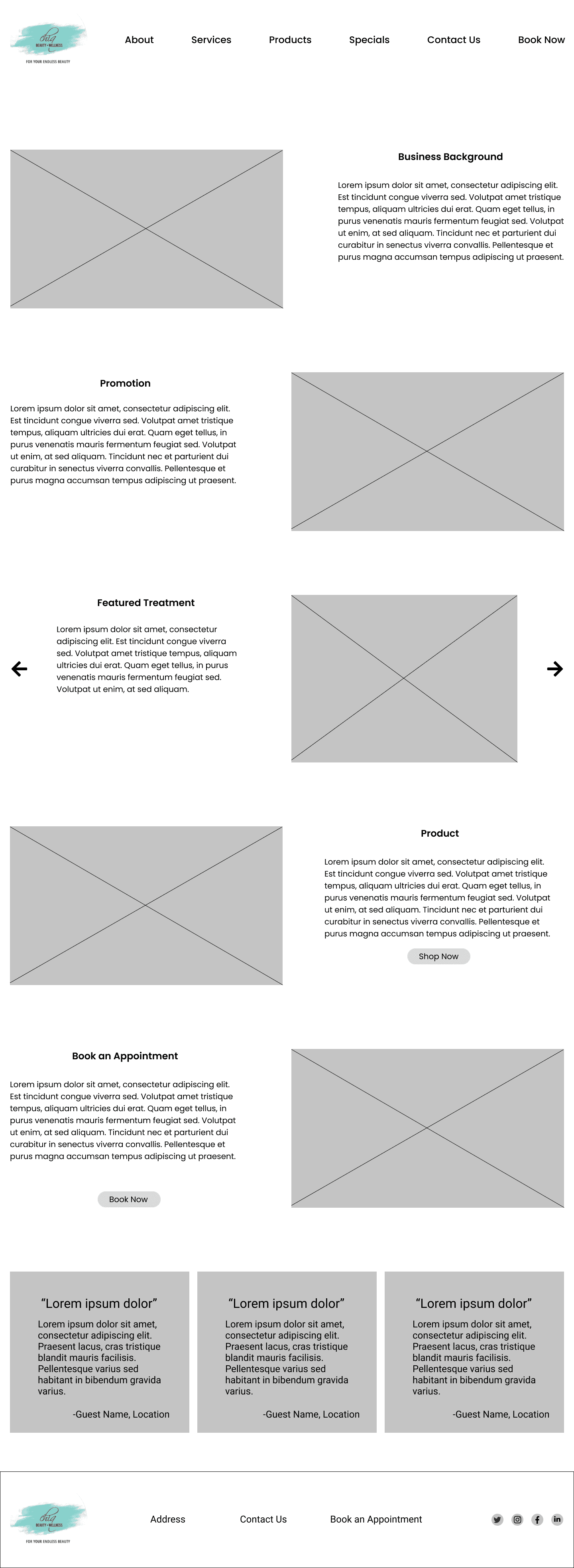

Homepage
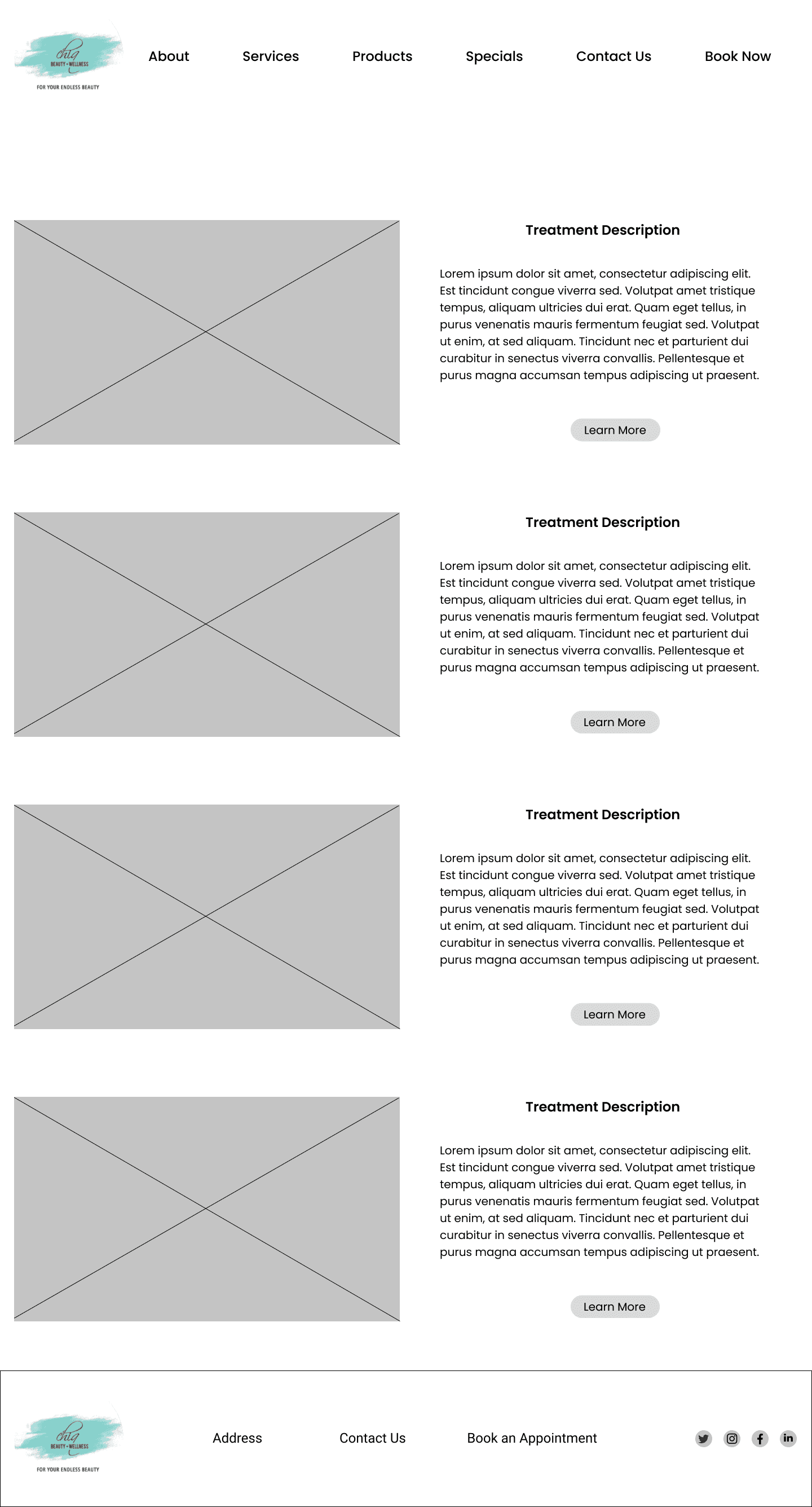

Treatment Page
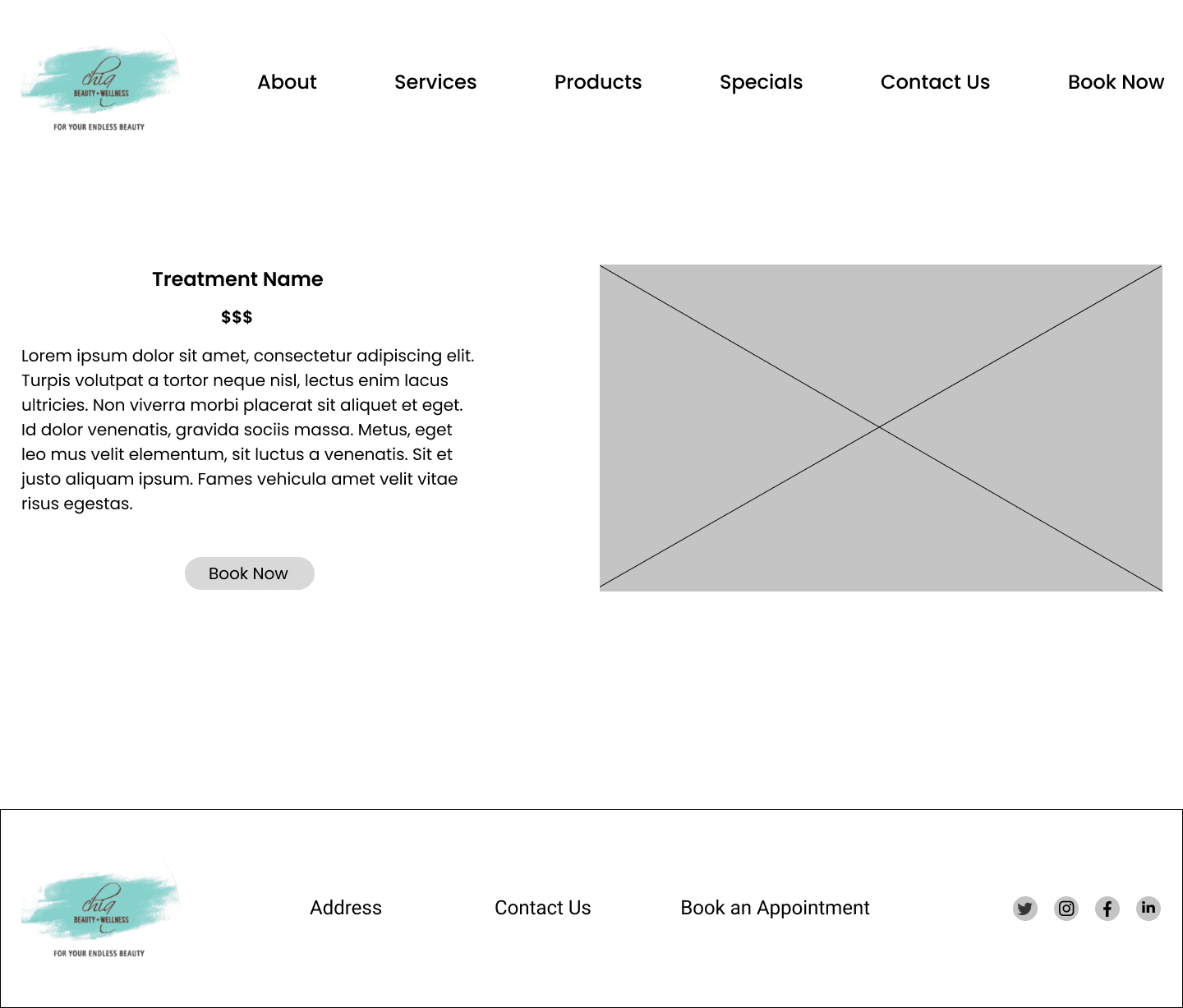

Treatement Details Page
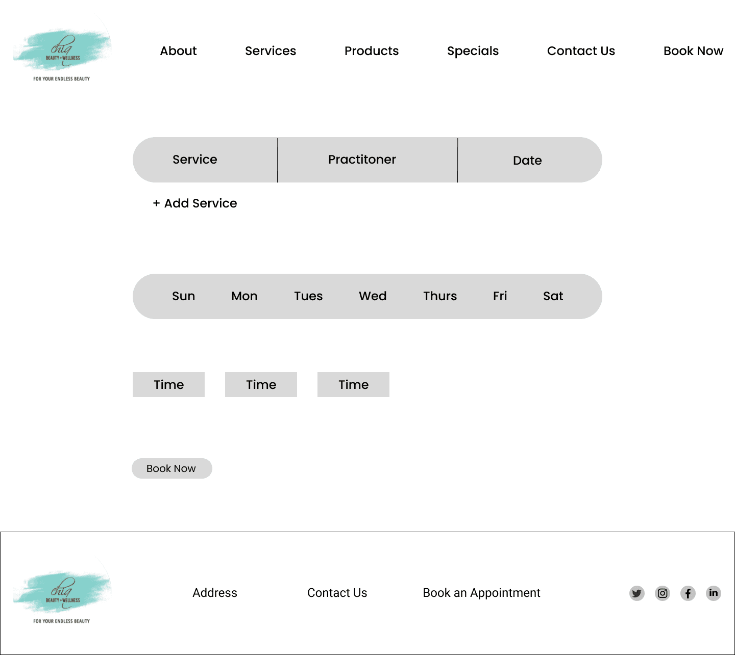

Booking Page
High Fidelity Wireframes
Prior to creating high fidelity wireframes, I wanted to brief my client with the design before conducting any usability testing. The initial design was overbearing on readability. The result of the meeting allowed me to iterate the wireframes to have a softer colour scheme that is easier on the eys for users when they navigate the website.
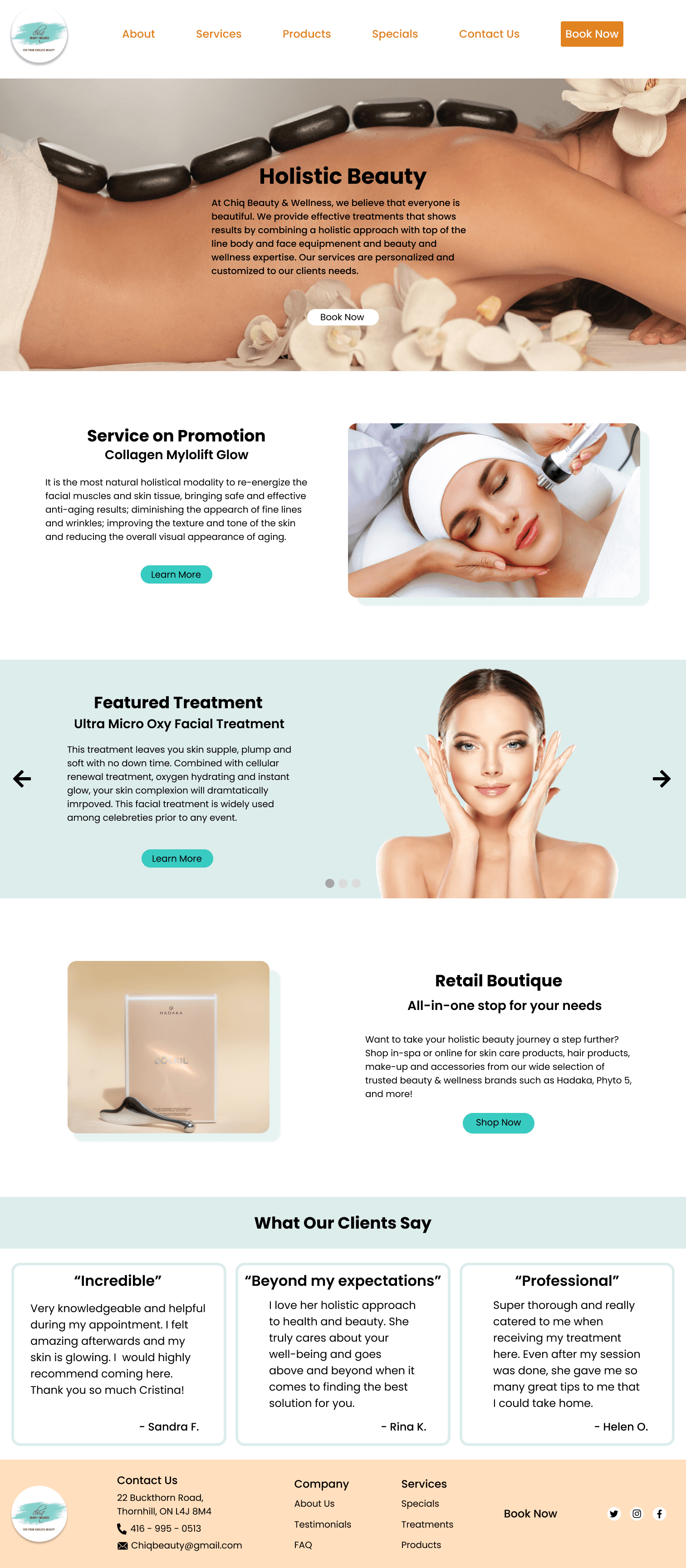

Homepage
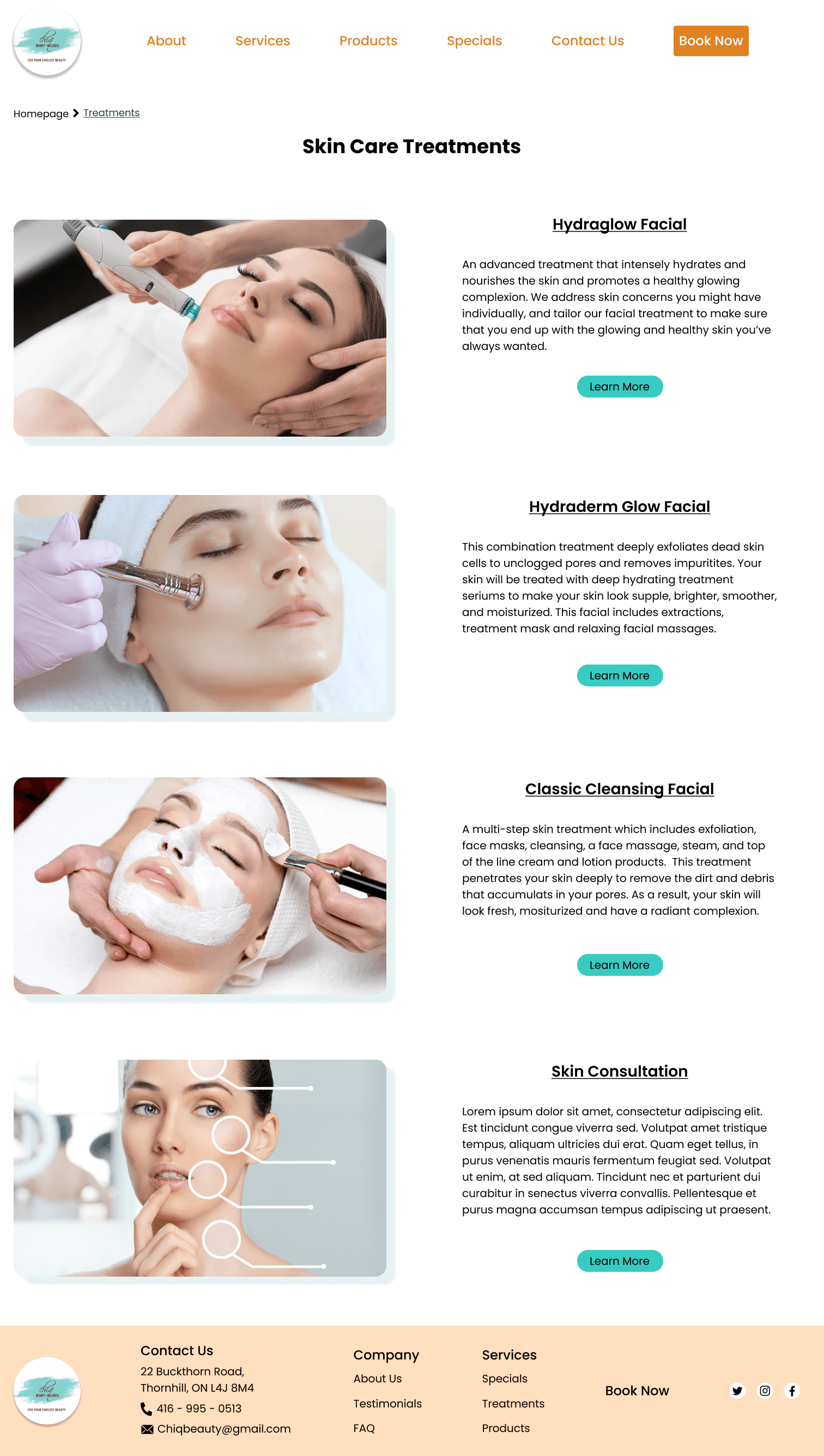

Treatment Page
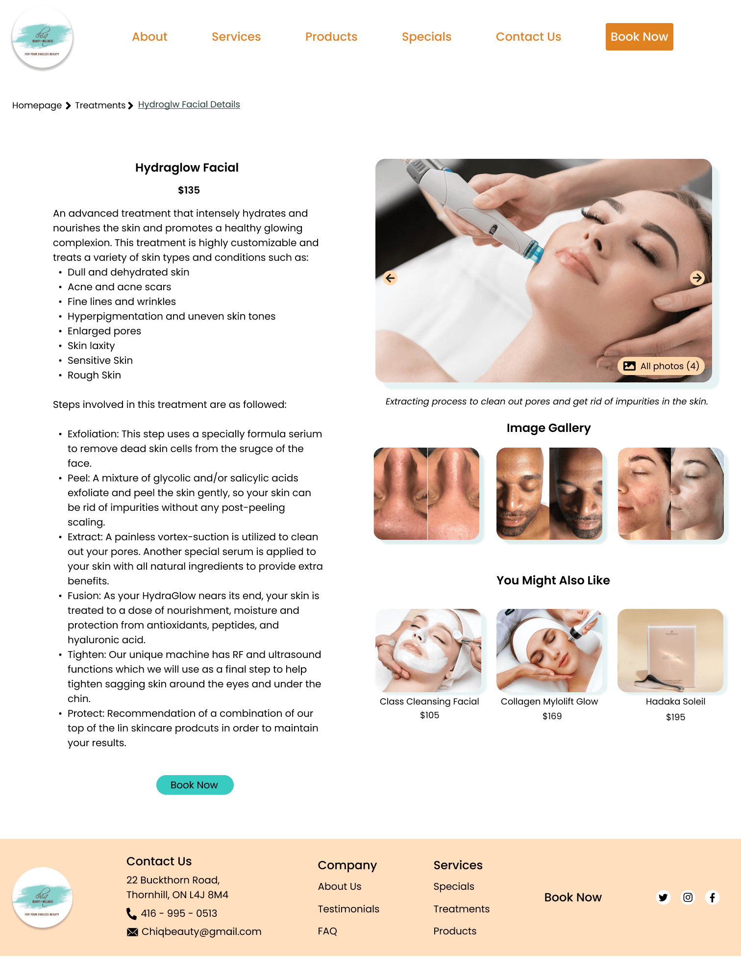

Treatment Details Page
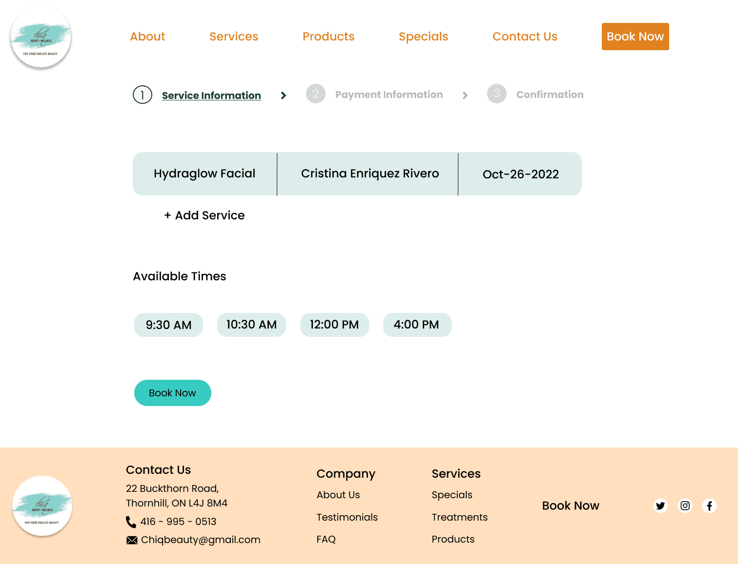

Booking Page
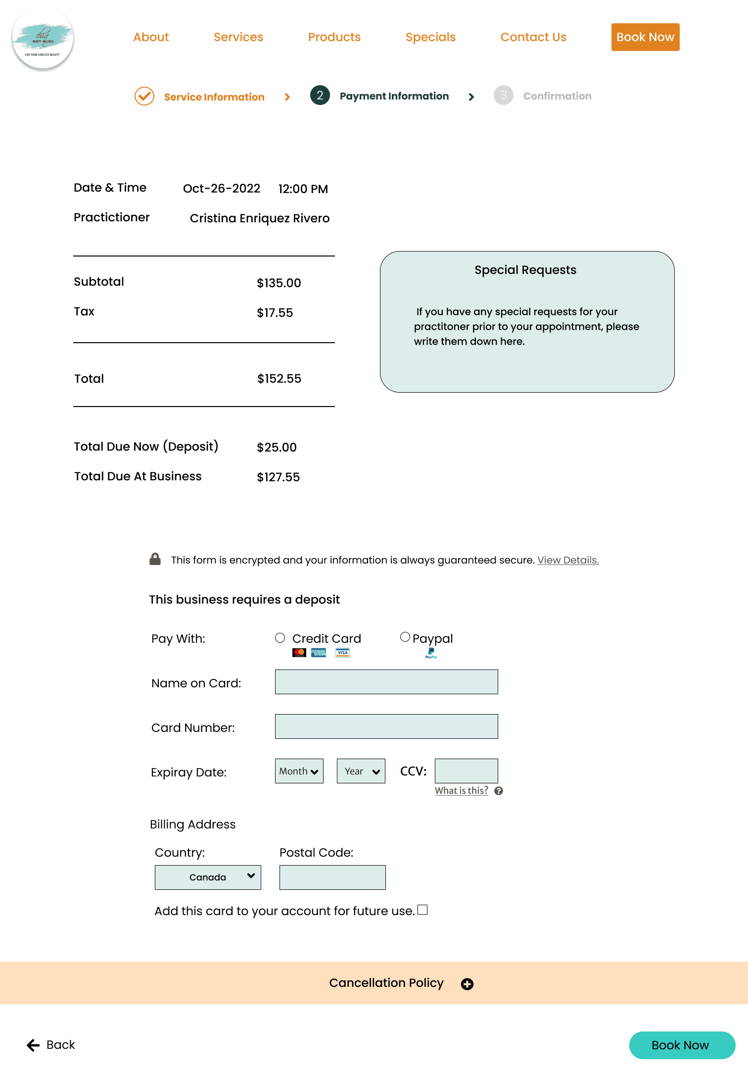

Payment Page
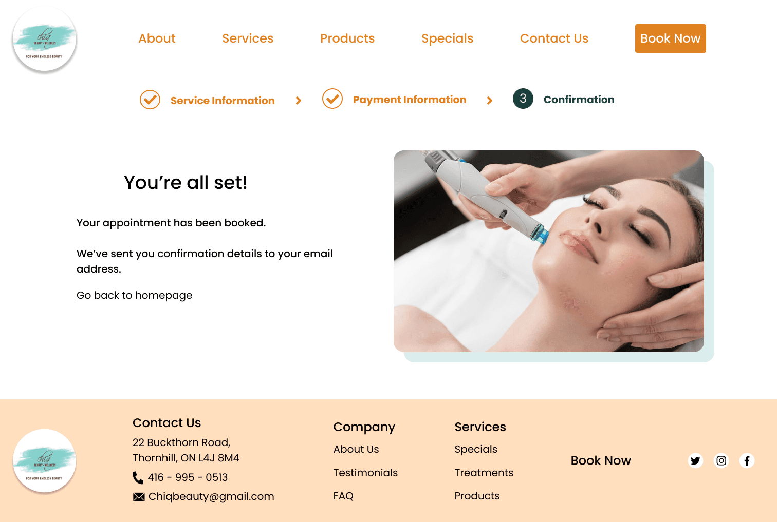

Confirmation Page
Testing
Affinity Map
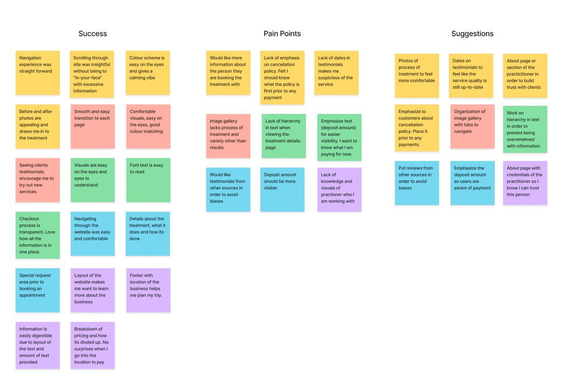
With my design in hand I moved on to conducting usability testing to gather feedback. I managed to interview 5 users through the use of Discord for voice communcation and screen sharing in combination with Maze for my participants to test out my prototype. After consolidating the responses, I created an affinity map to gain inisghts into where my prototype succeeded, what pain points my participants experienced, and any suggestions they have in order to improve the design.

Iterations
Creating a brand identity will elevate Zeit into achieving its goals and the user experience. In order to establish a brand identity, I created several artifacts such as logos, mood boards and style tile. I also created a UI kit in order to specify fonts, colours, logos, and imagery to assist in designing the user interface.
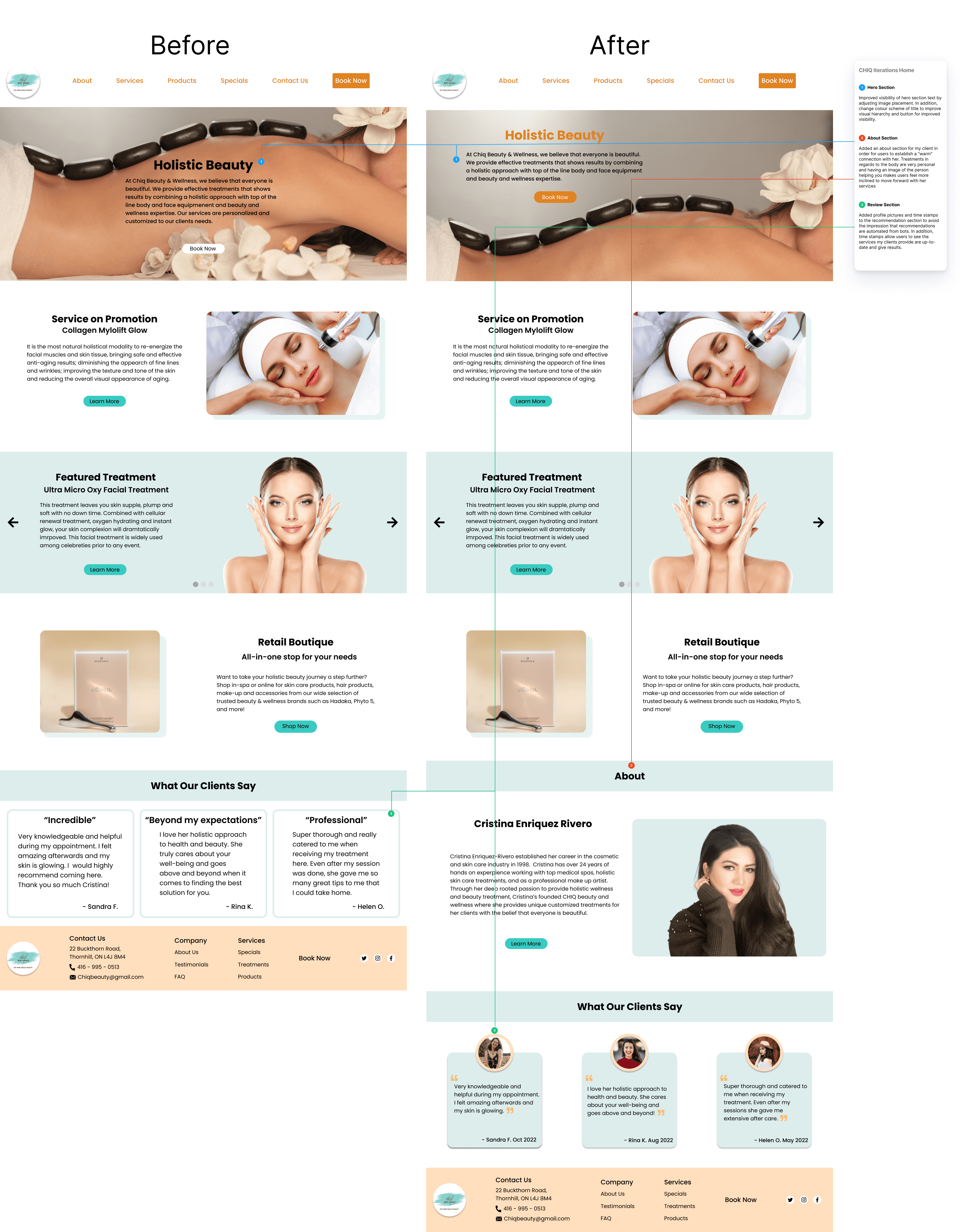

Improved visibility of the hero section. Added an about section in order to establish a warm connection with her clientele. Lastly, added profile pictures and time stamps on recommendation section to create more authenticity.
Treatment Page
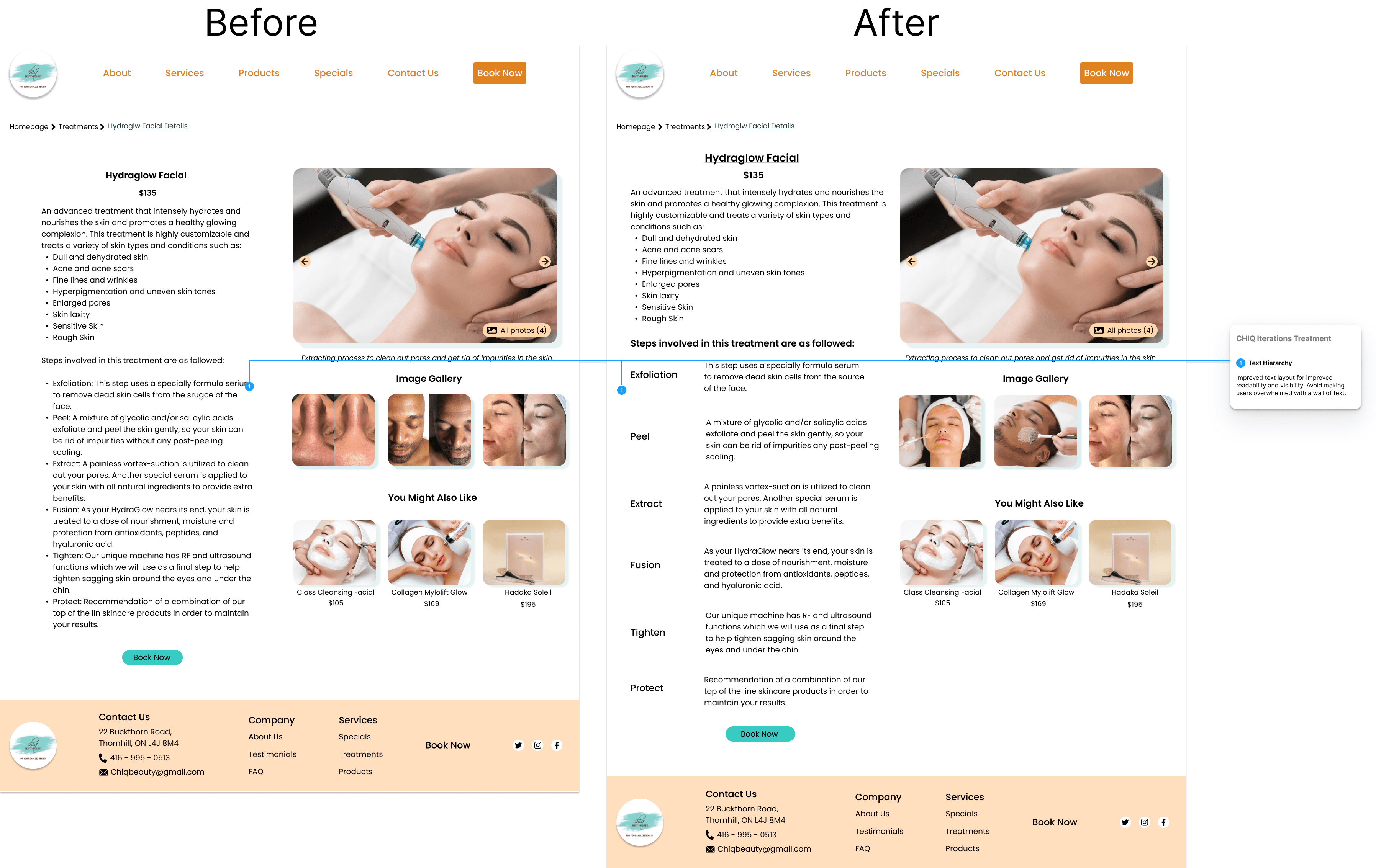
Improved text layout for improved readability and visibility. Avoid making users overwhlemed with walls of text.


Booking Page
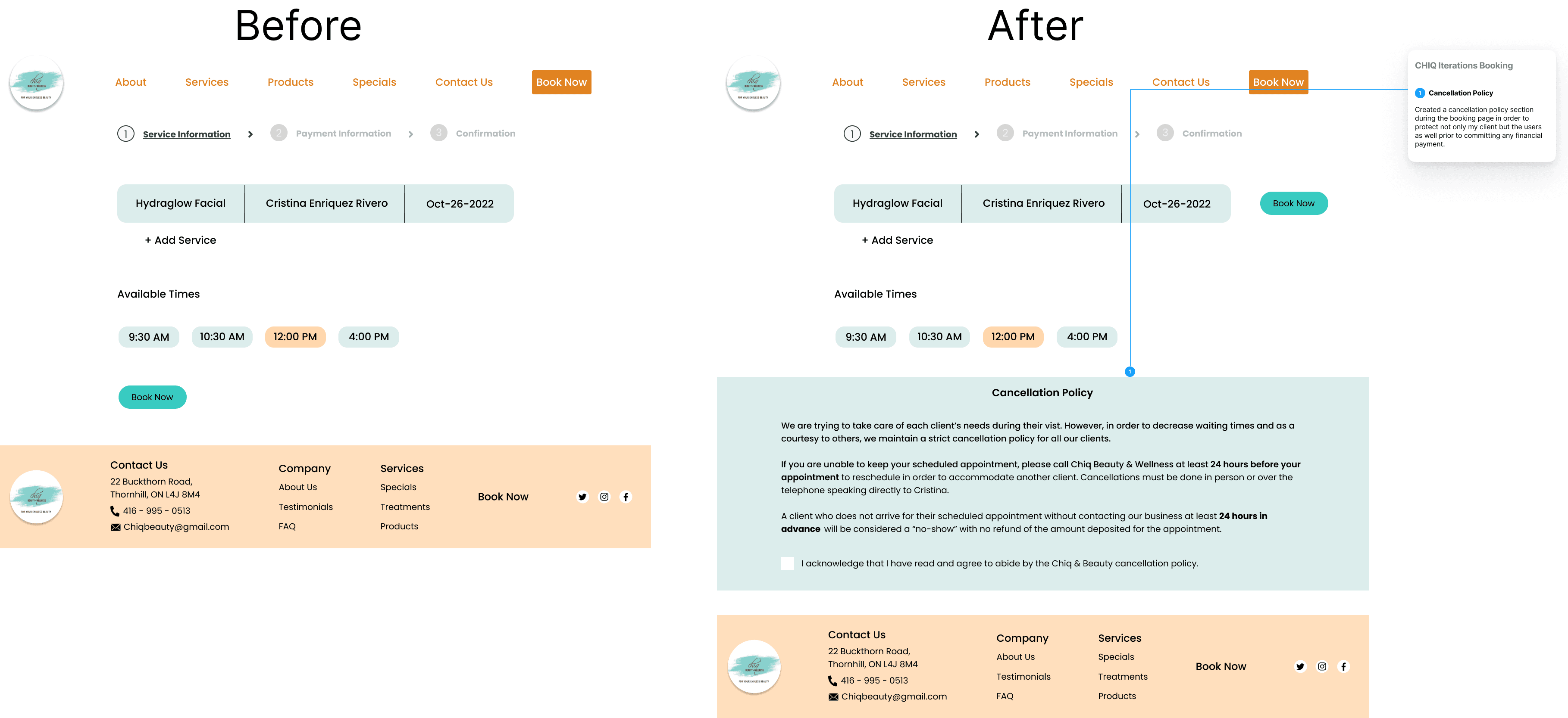
Created a cancellation policy section during the booking process in order to protect both my client and users prior to committing any financial payment.
Checkout Page
Changed the layout of the payment page to feel more cohesive and intuitive when navigating.


Conclusion
Thoughts
1
Final Words
This project was a rewarding experience for myself and highlited the importance of collaboration, research, and iteration in creating successful UX designs. However, there were many challenges and lessons I've learned throughout the duration of this project
2
Challenges
Constraints on the project were a huge challenge, especially in terms of time, client meetings, and design choices. Working with a client is vastly different that working on a passion project
Balancing my design choices between my client and the users. During this time, there were many situations in which my client's wants and needs did not align with user wants and needs
Communication with my client was inconsistent at times due to scheduling issues and other real life commitments
3
Key Takeaways
The amount of constraints related to the project taught me valuable lessons in time management and balancing the needs and wants of my client and users
Communication with your client is of the utmost importance. Especially in regards to updates, feedbacks, and deliverables
The opportunity I had to present my work to my client provided invaluable experience for me and made me more comfortable explaining my design choices
Other Projects
Let's Connect!
Matthewperezdesign@gmail.com
Chiq Beauty & Wellness is an independent business establish in 2006, offering a range of services from haircuts to customized skincare treatments. By combining a holistic approach with advanced and innovative skin care product and over 24 years of experience, Chiq's Beauty & Wellness provides effective treatments that show results and improvement of overall health.
Client
Chiq Beauty
Services
Web Design Branding
Industry
Beauty & Wellness
Date
November 2022


Problem
Despite a strong reputation for effective and personalized care, Chiq's online presence is scattered across Instagram, Facebook, and Vagaro. How might we consolidate these platforms into a unified, intuitive hub for customers?
Solution
Create a website that will allow the owner to have more control of her brand and easily reach her clientele. Streamline her existing presence online into one place in order for clients to have a smooth booking process, access to detailed information, and overview of her services and products.
Research
Research
Research Plan
To understand the business better, I began by interviewing the owner and existing clientele. Through these conversations I learned that while word-of-mouth referrals were key to acquiring new customers, the lack of cohesive online presence was hindering the business's growth. Customers wanted a seamless booking process and easy access to detailed information about services and products.
User Interviews
1
Motivations
Users want to feel good and look good
Helping independent business owners over corporations
Unique service Chiq provides that are unavailable in other competitors
2
Pain Points
Unable to purchase products from client due to lack of product pages
Finding ways to book is tedious and makes users give up
Lack of images on how business owner conducts services
3
Primary Goals
Visible platform that makes it easy for users to book appointments
Visuals in order for users to have an idea what the services are like and what the results may be
Easily obtain information about any product or service


Competitive Analysis
Taking it one step further, I conducted a competitve analysis of the business landscape. I wanted to get a deeper understanding of the industry and what factors contribute to a business's success and failures. My client strictly runs her business by herself and proves to be quite challenging when she competes not only with known good brand companies, but other small businesses as well.


Define
Define
Empathy Map
Now that I have my research completed, I created an empathy map in order to help guide the design process. I wanted to empathize with the user journey from discovering the business. booking an appointment, getting treatment, and what happens after the appointment.


Persona
Using the findings from my user interviews and the empathy map I created, I managed to crate a persona, Sarah Thompson, in order to aid me in my design process. I will be referring back to Sarah when it comes to making design decisions as she represents the human factor in the design.


Ideate
Ideate
Information Architecture
The goal was to create a website that not only met the business objectives but also resonated with users. I mapped out the site structure with the use of my clients current online presnece in Vagaro and secondary research from her competitors. I wanted to ensure that not only the existing information is updated but also add additional sections that my client lacked and what my users would like to see.


Task Flow
From my earlier meeting with my client, her main goal was for her customers to book a treatment session via her website. In addition, from the data I gathered from my user interviews, I incorporated their goals in mind which is to find information on specific treatments and having an intuitivie booking process. With these two goals aligning, I decided to create a task flow with the goal of booking skin care treatments.


User Flow
Keeping Sarah in mind, I took the task flow a step further and created a user flow. I wanted to visualize Sarah's journey when navigating through Chiq's Beauty & Wellness website.


Sketches
Now that I have established my information architecture, I decided to create some sketches of potential layouts before doing any wireframes, These sketches will give me a better sense of direction as to what I can design before jumping into Figma.


Homepage


Treatment Page


Treatment Details Page


Booking Page
Branding
I consulted my client to see if she had any inspiration or mood boards she would like to share with me. I did this in order to have a better idea of what imagery and themes should would like the website to convey to her clients. Initially my client gave me links to Instagram pages of skin card product companies where their page themes emphasized nature, well-being, and health. Although I had specific themes my client was aiming for, I didn't have a specific colour scheme in mind. That is until I discovered my client had an old business card she personally made a while back. I decided to use those colours on the card and incorporate them into the design.


Prototype
Prototype
Low Fidelity Wireframes
Once I had a visual direction with my design, I moved into Figma to create low fidelity wireframes. These wireframes will serve as the foundation of gaining user feedback during my usability testing.


Homepage


Treatment Page


Treatement Details Page


Booking Page
High Fidelity Wireframes
Prior to creating high fidelity wireframes, I wanted to brief my client with the design before conducting any usability testing. The initial design was overbearing on readability. The result of the meeting allowed me to iterate the wireframes to have a softer colour scheme that is easier on the eys for users when they navigate the website.


Homepage


Treatment Page


Treatment Details Page


Booking Page


Payment Page


Confirmation Page
Testing
Testing
Affinity Map
With my design in hand I moved on to conducting usability testing to gather feedback. I managed to interview 5 users through the use of Discord for voice communcation and screen sharing in combination with Maze for my participants to test out my prototype. After consolidating the responses, I created an affinity map to gain inisghts into where my prototype succeeded, what pain points my participants experienced, and any suggestions they have in order to improve the design.


Iterations
Now that I had the data from my users, I went back into Figma in order to iterate on my designs and make key changes. The booking process was streamlined, and detailed information about treatments and products was readily available. The addition of an about section and personalized recommendations helped create a warm and inviting online presence.


Homepage
Improved visibility of the hero section. Added an about section in order to establish a warm connection with her clientele. Lastly, added profile pictures and time stamps on recommendation section to create more authenticity.
Treatment Page
Improved text layout for improved readability and visibility. Avoid making users overwhlemed with walls of text.


Booking Page
Created a cancellation policy section during the booking process in order to protect both my client and users prior to committing any financial payment.
Checkout Page
Changed the layout of the payment page to feel more cohesive and intuitive when navigating.


Conclusion
Conclusion
Thoughts
1
Final Words
This project was a rewarding experience for myself and highlited the importance of collaboration, research, and iteration in creating successful UX designs. However, there were many challenges and lessons I've learned throughout the duration of this project
2
Challenges
Constraints on the project were a huge challenge, especially in terms of time, client meetings, and design choices. Working with a client is vastly different that working on a passion project
Balancing my design choices between my client and the users. During this time, there were many situations in which my client's wants and needs did not align with user wants and needs
Communication with my client was inconsistent at times due to scheduling issues and other real life commitments
3
Key Takeaways
The amount of constraints related to the project taught me valuable lessons in time management and balancing the needs and wants of my client and users
Communication with your client is of the utmost importance. Especially in regards to updates, feedbacks, and deliverables
The opportunity I had to present my work to my client provided invaluable experience for me and made me more comfortable explaining my design choices
Let's Connect!
Matthewperezdesign@gmail.com
Let's Connect!
Matthewperezdesign@gmail.com
Chiq Beauty & Wellness is an independent business establish in 2006, offering a range of services from haircuts to customized skincare treatments. By combining a holistic approach with advanced and innovative skin care product and over 24 years of experience, Chiq's Beauty & Wellness provides effective treatments that show results and improvement of overall health.
Client
Chiq Beauty
Services
Web Design Branding
Industry
Beauty & Wellness
Date
November 2022


Problem
Despite a strong reputation for effective and personalized care, Chiq's online presence is scattered across Instagram, Facebook, and Vagaro. How might we consolidate these platforms into a unified, intuitive hub for customers?
Solution
Create a website that will allow the owner to have more control of her brand and easily reach her clientele. Streamline her existing presence online into one place in order for clients to have a smooth booking process, access to detailed information, and overview of her services and products.
Research
Research
Research Plan
To understand the business better, I began by interviewing the owner and existing clientele. Through these conversations I learned that while word-of-mouth referrals were key to acquiring new customers, the lack of cohesive online presence was hindering the business's growth. Customers wanted a seamless booking process and easy access to detailed information about services and products.
User Interviews
1
Motivations
Users want to feel good and look good
Helping independent business owners over corporations
Unique service Chiq provides that are unavailable in other competitors
2
Pain Points
Unable to purchase products from client due to lack of product pages
Finding ways to book is tedious and makes users give up
Lack of images on how business owner conducts services
3
Primary Goals
Visible platform that makes it easy for users to book appointments
Visuals in order for users to have an idea what the services are like and what the results may be
Easily obtain information about any product or service


Competitive Analysis
Taking it one step further, I conducted a competitve analysis of the business landscape. I wanted to get a deeper understanding of the industry and what factors contribute to a business's success and failures. My client strictly runs her business by herself and proves to be quite challenging when she competes not only with known good brand companies, but other small businesses as well.


Define
Define
Empathy Map
Now that I have my research completed, I created an empathy map in order to help guide the design process. I wanted to empathize with the user journey from discovering the business. booking an appointment, getting treatment, and what happens after the appointment.


Persona
Using the findings from my user interviews and the empathy map I created, I managed to crate a persona, Sarah Thompson, in order to aid me in my design process. I will be referring back to Sarah when it comes to making design decisions as she represents the human factor in the design.


Ideate
Ideate
Information Architecture
The goal was to create a website that not only met the business objectives but also resonated with users. I mapped out the site structure with the use of my clients current online presnece in Vagaro and secondary research from her competitors. I wanted to ensure that not only the existing information is updated but also add additional sections that my client lacked and what my users would like to see.


Task Flow
From my earlier meeting with my client, her main goal was for her customers to book a treatment session via her website. In addition, from the data I gathered from my user interviews, I incorporated their goals in mind which is to find information on specific treatments and having an intuitivie booking process. With these two goals aligning, I decided to create a task flow with the goal of booking skin care treatments.


User Flow
Keeping Sarah in mind, I took the task flow a step further and created a user flow. I wanted to visualize Sarah's journey when navigating through Chiq's Beauty & Wellness website.


Sketches
Now that I have established my information architecture, I decided to create some sketches of potential layouts before doing any wireframes, These sketches will give me a better sense of direction as to what I can design before jumping into Figma.

Homepage

Treatment Page

Treatment Details Page

Booking Page
Branding
I consulted my client to see if she had any inspiration or mood boards she would like to share with me. I did this in order to have a better idea of what imagery and themes should would like the website to convey to her clients. Initially my client gave me links to Instagram pages of skin card product companies where their page themes emphasized nature, well-being, and health. Although I had specific themes my client was aiming for, I didn't have a specific colour scheme in mind. That is until I discovered my client had an old business card she personally made a while back. I decided to use those colours on the card and incorporate them into the design.


Prototype
Prototype
Low Fidelity Wireframes
Once I had a visual direction with my design, I moved into Figma to create low fidelity wireframes. These wireframes will serve as the foundation of gaining user feedback during my usability testing.

Homepage

Treatment Page

Treatement Details Page

Booking Page
High Fidelity Wireframes
Prior to creating high fidelity wireframes, I wanted to brief my client with the design before conducting any usability testing. The initial design was overbearing on readability. The result of the meeting allowed me to iterate the wireframes to have a softer colour scheme that is easier on the eys for users when they navigate the website.


Homepage


Treatment Page


Treatment Details Page


Booking Page


Payment Page


Confirmation Page
Testing
Testing
Affinity Map
With my design in hand I moved on to conducting usability testing to gather feedback. I managed to interview 5 users through the use of Discord for voice communcation and screen sharing in combination with Maze for my participants to test out my prototype. After consolidating the responses, I created an affinity map to gain inisghts into where my prototype succeeded, what pain points my participants experienced, and any suggestions they have in order to improve the design.


Iterations
Now that I had the data from my users, I went back into Figma in order to iterate on my designs and make key changes. The booking process was streamlined, and detailed information about treatments and products was readily available. The addition of an about section and personalized recommendations helped create a warm and inviting online presence.


Homepage
Improved visibility of the hero section. Added an about section in order to establish a warm connection with her clientele. Lastly, added profile pictures and time stamps on recommendation section to create more authenticity.
Treatment Page
Improved text layout for improved readability and visibility. Avoid making users overwhlemed with walls of text.


Booking Page
Created a cancellation policy section during the booking process in order to protect both my client and users prior to committing any financial payment.


Checkout Page
Changed the layout of the payment page to feel more cohesive and intuitive when navigating.
Conclusion
Conclusion
Thoughts
1
Final Words
This project was a rewarding experience for myself and highlited the importance of collaboration, research, and iteration in creating successful UX designs. However, there were many challenges and lessons I've learned throughout the duration of this project
2
Challenges
Constraints on the project were a huge challenge, especially in terms of time, client meetings, and design choices. Working with a client is vastly different that working on a passion project
Balancing my design choices between my client and the users. During this time, there were many situations in which my client's wants and needs did not align with user wants and needs
Communication with my client was inconsistent at times due to scheduling issues and other real life commitments
3
Key Takeaways
The amount of constraints related to the project taught me valuable lessons in time management and balancing the needs and wants of my client and users
Communication with your client is of the utmost importance. Especially in regards to updates, feedbacks, and deliverables
The opportunity I had to present my work to my client provided invaluable experience for me and made me more comfortable explaining my design choices
Other Projects
Let's Connect!
Matthewperezdesign@gmail.com
Let's Connect!
Matthewperezdesign@gmail.com
